


Laika Virgin
I was asked to design a web page for a band called Laika Virgin. By the time I started working on the concept for this design, they had released one album, two EP’s and a new album was on its way. I had much creative freedom with this project and I wanted to do something bold and different.
Band members wanted the website to look mainly black and white. To make it pop, they chose orange as an additional colour to add contrast. But still, it looked a bit too faint, so we decided to use a red colour instead.
The website’s main purpose is to promote their latest release and works in general. When landing on the page, you are presented with information about the new album. There’s also a player on the bottom of the screen which lets the user listen to a few teasers from the latest album.
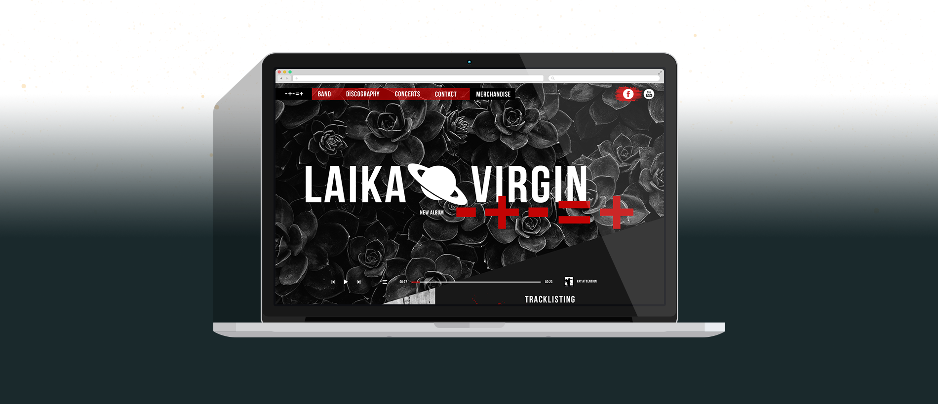

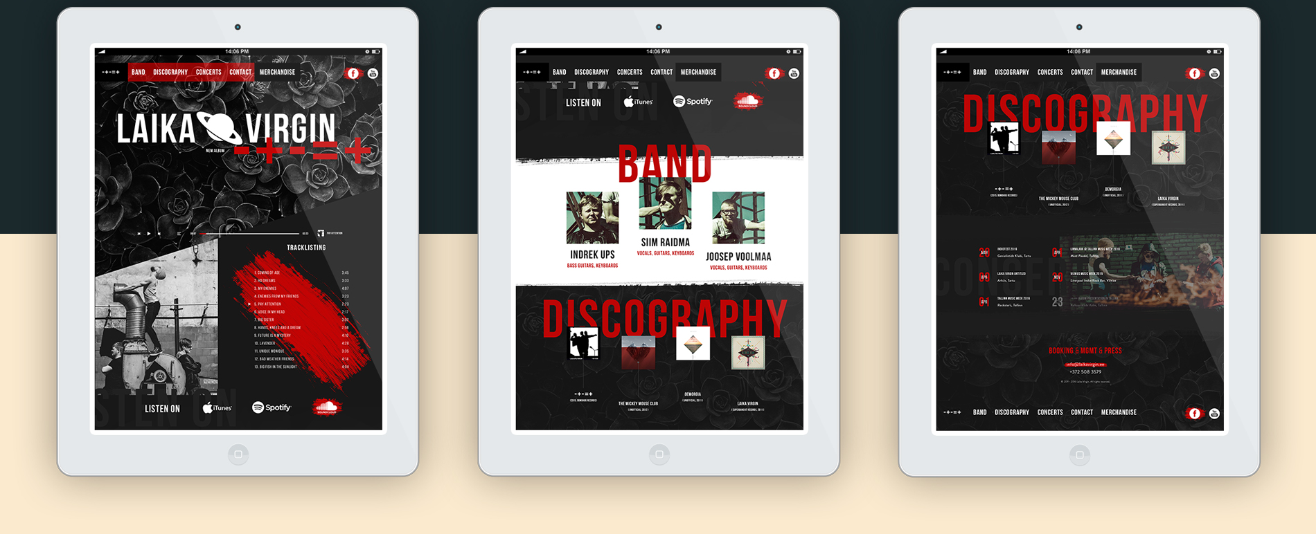
The website has five sections: promotion of the new album, information about band members, discography, concerts and contacts.

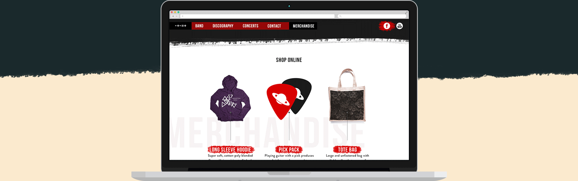
Although it’s a one page design, when clicking on the MERCHANDISE link, you’re taken to another page with shopping options. When the user decides to buy something, he’s taken to an external site where he can finish the transaction and complete the order.

For a more detailed view, check out the full pixels here.
And now, after all the hard work, you can sit back and enjoy Laika Virgin's video Lavender.
ROLE: Web Design + HTML / CSS / jQuery
VIEW PAGE: http://laikavirgin.ee/ (...under development)