Design System
Scaling Products with Smart, Flexible Design Systems
I believe a good design system isn’t just a set of UI components—it’s the backbone of a fast-moving product team. It keeps designs consistent, speeds up development, and ensures teams work together smoothly. But the best design systems go beyond UI.
They help businesses scale efficiently, adapt to change, and remove unnecessary friction. A well-structured system isn’t just about design—it’s a business asset that saves time, improves collaboration, and makes products easier to evolve.
My approach focuses on building systems that drive impact, not just maintain consistency:
Reduce repetitive work
Teams can reuse components instead of reinventing them.
Ensure consistency
Products feel cohesive across platforms, teams, and updates.
Streamline workflows
AI can assist with documentation, updates, and governance.
Support long-term growth
A scalable system evolves as the business expands.


Why Businesses Need Scalable Systems
The Challenge
Design systems were meant to make product development faster, more cohesive, and higher quality. But in many cases, teams struggle with rigid, overly complex systems that slow them down instead of helping them.
In my experience, without a structured yet flexible approach:
- Designers waste time recreating components instead of solving real user problems.
- Developers struggle with inconsistent designs, leading to longer development cycles.
- Products become fragmented, hurting brand trust and user experience.
- Scaling becomes chaotic, as design debt multiplies and teams work in silos.
A great design system should empower teams—not restrict them. It should provide structure without stifling creativity and evolve with the business, not against it. That’s the approach I take—helping companies build systems that are scalable, adaptable, and actually useful.
The Solution
Instead of rigid, over-engineered libraries, I build scalable, adaptable systems that evolve with the business and actually make work easier. For me, a great design system balances structure and flexibility:
- It removes repetitive work so teams can ship faster.
- It ensures consistency without blocking creativity.
- It scales with the product instead of becoming a burden over time.
AI and automation can help detect inconsistencies and keep documentation up to date, but at the core, a strong design system starts with strategy, not just technology.
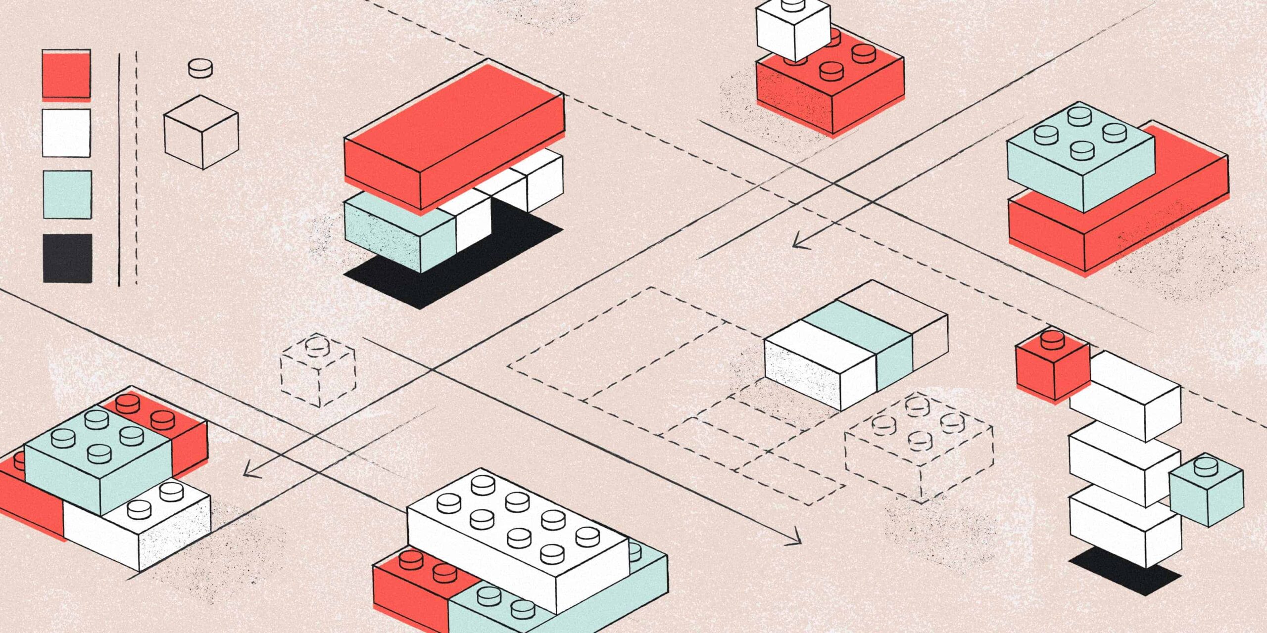

Design Systems as a Business Strategy
I don’t see design systems as just a set of rules or reusable components. To me, a great design system is an operational framework that makes work easier, not harder. It connects design, product, and engineering so teams can move faster, scale efficiently, and still maintain quality. I’ve seen too many teams get slowed down by overly complex systems—ones that focus more on governance than getting things done. Instead, I believe a smart system should:
- Make work faster – no one should have to design the same button 10 times.
- Support scaling – as the company grows, the system should evolve with it, not hold it back.
- Ensure quality – products should stay cohesive without adding unnecessary friction.
Balancing Speed and Innovation
The biggest challenge? Speed vs. creativity.
I’ve worked on systems that were so rigid they killed new ideas. And I’ve seen the opposite—where a lack of structure led to design chaos.
I believe the best design systems give teams the freedom to experiment while keeping things structured enough to scale.
AI-assisted workflows can help reduce friction, but design leadership needs to make sure teams don’t lose their creative edge.
Design Systems That Scale with Business Needs
A good design system isn’t just about visuals—it helps businesses work faster, cut costs, and stay consistent as they grow. Without a system, teams waste time fixing the same problems, and products feel messy. A strong system keeps everything smooth and scalable.
Here’s how I build design systems that make an impact:
Fix Inconsistencies
Without a system, design choices get messy. I help teams keep everything consistent, so users get a smooth and reliable experience.
Make Scaling Easy
As a business grows, the design system should grow too. I build systems that let teams expand without having to start from scratch.
Reduce Repetitive Work
Teams shouldn’t waste time recreating the same buttons and layouts. I create reusable components that speed up design and development.
Connect Teams
A design system is more than a style guide—it helps designers, developers, and product teams work together without confusion.
Help Teams Onboard Faster
New team members shouldn’t struggle to understand the product. A clear design system helps them get up to speed quickly and work more confidently.
Speed Up Product Releases
A good system makes updates faster and easier, so teams can launch new features without delays.
My Take on Balancing Speed, Consistency, and Quality
I believe that a great design system isn’t just about efficiency—it’s about helping teams create better products without sacrificing creativity. While structured systems bring speed and consistency, they should never come at the cost of quality or innovation.
- Speed: A well-built system speeds up work by reducing repetitive tasks. But speed alone isn’t enough—if teams only focus on what’s already in the system, they might miss opportunities for better solutions. A system should enable faster execution without limiting exploration.
- Consistency: Design systems bring structure, but that doesn’t mean every product should look and feel the same. Consistency should enhance, not replace, brand expression. The best systems create a foundation while allowing teams to adapt and evolve.
- Quality: A strong system sets the stage for high-quality design, but good decisions still matter. Tools and guidelines help, but great design comes from thoughtful problem-solving—not just following a framework. I focus on making sure systems provide structure while keeping creativity and strategic thinking at the core.
The goal isn’t just to enforce rules—it’s to build a system that helps teams work faster, scale smarter, and create products that truly stand out.


