


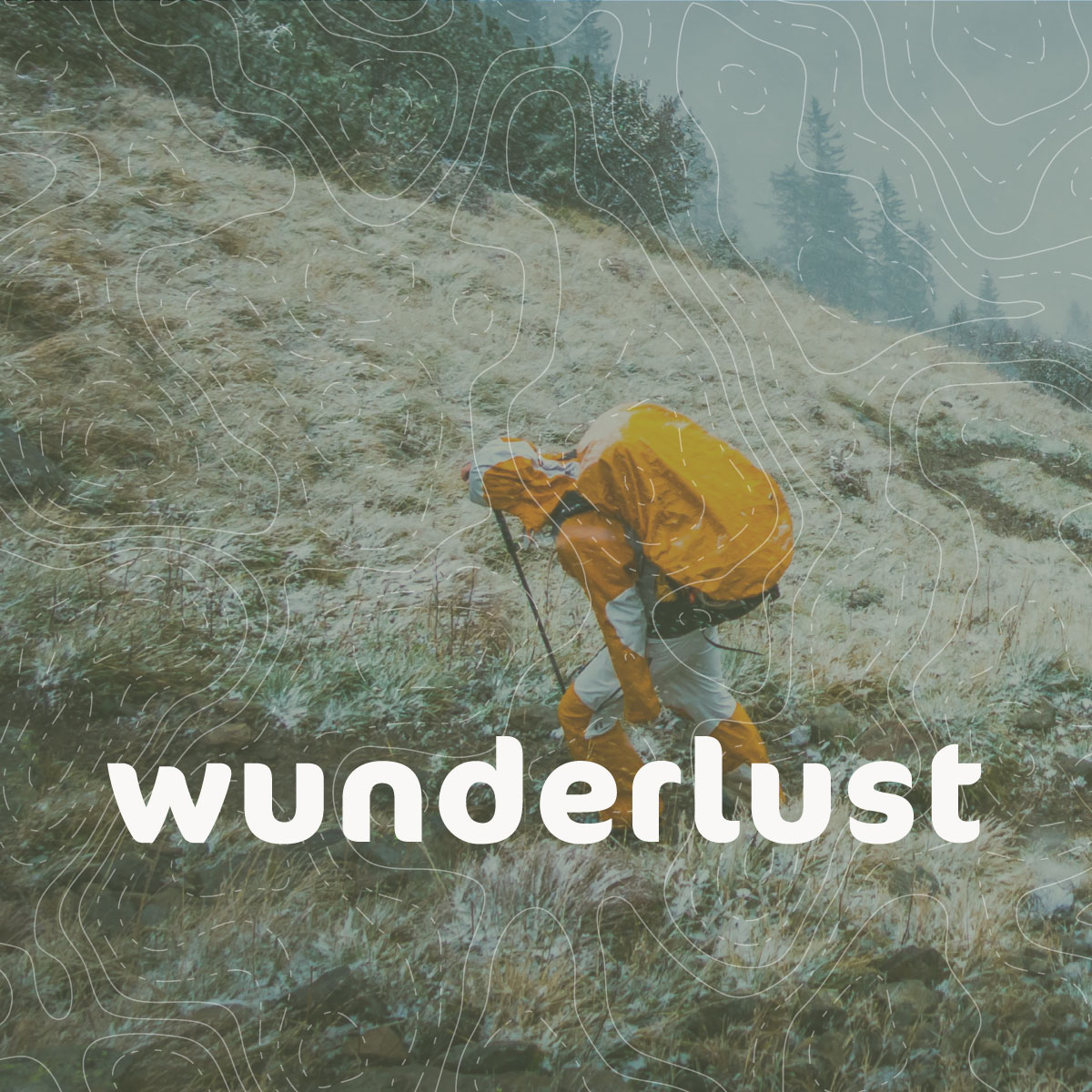
WUNDERLUST
IDENTITY
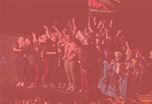
Wunderlust is a Sweden based company that runs survival courses in the wild. Survival situations often comes without warning. Therefore we have to be ready and be able to face any consequences. We could get lost in the forest, be victim of collision or a natural disaster. Wunderlust's courses provide techniques, tools and confidence to react correctly when a survival situation comes to us.


ROLE:
Graphic design, illustration, icon design
CLIENT:
Wunderlust
YEAR:
2017
CONCEPT
Wunderlust is composed of three Swedish guys who share mutual love for nature and hiking. What started out as a hobby with friends, has now grown into a business. Wunderlust’s identity needed to reflect team’s personality and business as well as attract the ideal nature-loving customer.

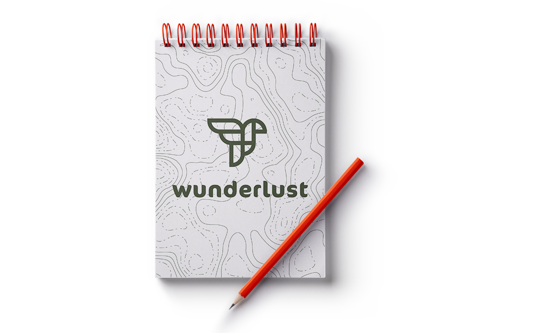
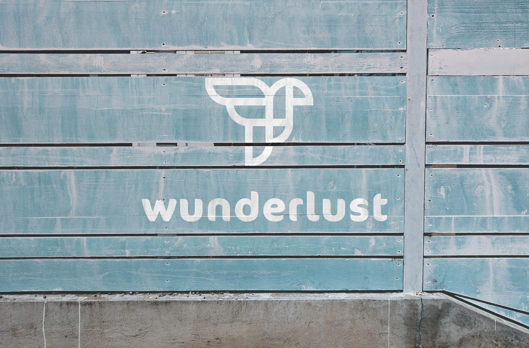
LOGO
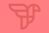
Client wanted the logo to be nature related, both in sense of mark and colour. The idea behind the survival course is that the acquired skills give us the tools which help us to survive in nature. We’ve forgotten what it means to be a part of it and when we’re reminded of that, it gives us a sense of freedom. FREEDOM became the concept for the identity and we decided to design the logomark as a bird with spread wings. We went for a military / olive green kind of a colour because it fits seamlessly into nature.
I started off with sketching the ideas. Here you can see the almost final result that I was happy with.
Then I took my sketch into Illustrator and finalized the logo with gridding it into perfect shapes.
And here's the final result that everyone's happy with.
TYPOGRAPHY
We went for a warm, round and friendly type to balance the harshness and cruelty of the wild nature. FF Cocon script was created in 1998 by a Dutch type designer Evert Bloemsma.
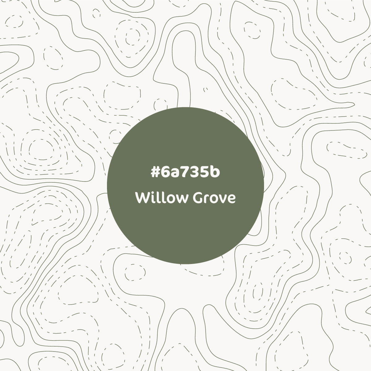

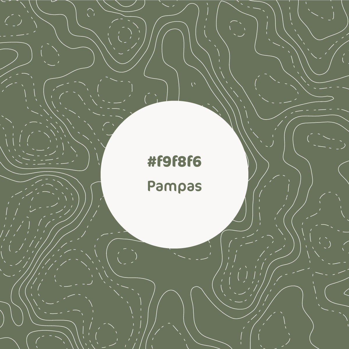


COLOURS
There are two base colours - a military green and a greyish/creamish white which can be used to bring out contrast. In order to not make it look too grim, we came up with a colour palett of bright colours.
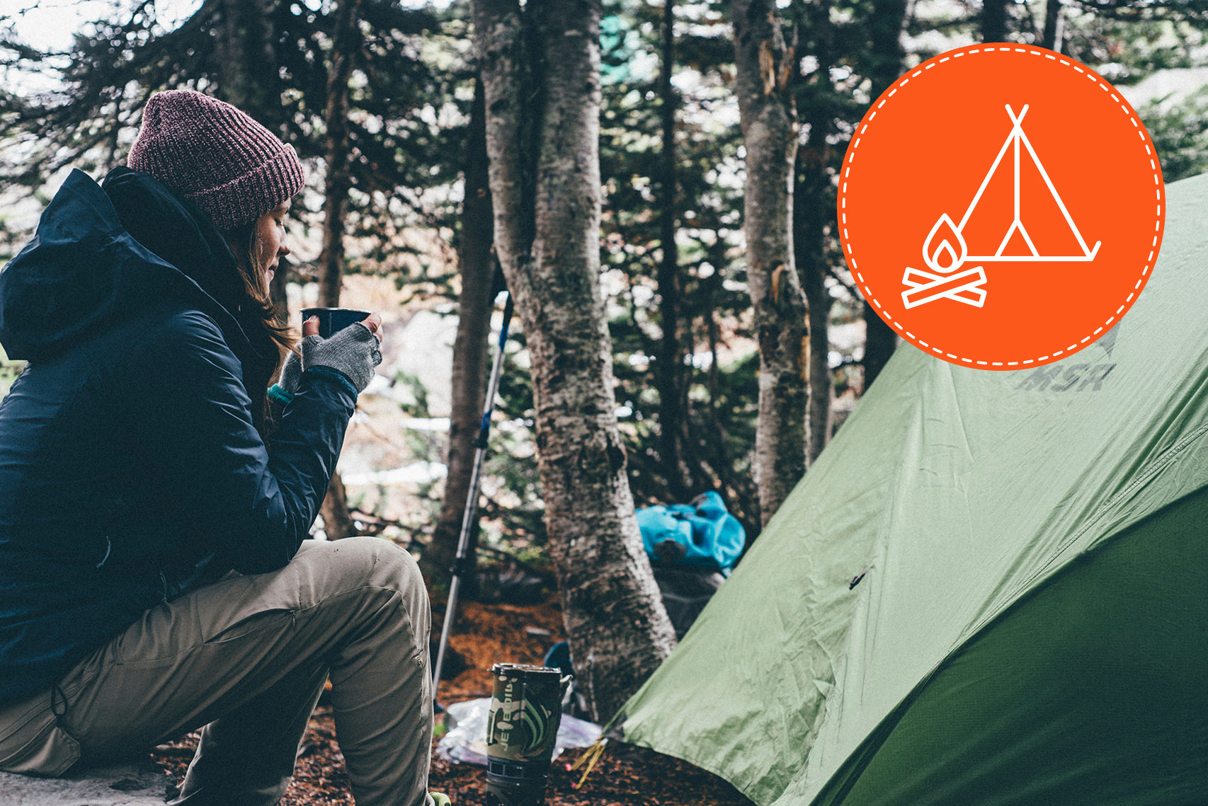
ICONS
Wunderlust needed little signs for the fifteen most used keywords in their business. We designed an icon pack which will be used on the web, brochures or any other marketing materials.
OUTRO
There's actually no outro on this case study because Wunderlust's identity is not set in stone. It is fluid and ever-changing, just like nature is. This case study will be updated soon! :)


Thanks for reading & stay awesome!