


Warning: Trying to access array offset on value of type bool in /data01/virt37876/domeenid/www.ragne.me/htdocs/wp-content/themes/semplice/includes/shortcodes.php on line 97
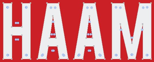
HAAM
MASTER OF QUALITY
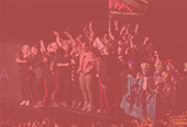
HAAM is a family owned construction business established in 2015 by Raido who, at the moment, is the only craftsman in the company. His versatile skills and extensive experience speak for themselves, as he never runs out of projects to work on. Because of his excellent work, he’s got many happy clients spreading the good word about him and his work quality. After 14 years of working in the field, he felt his work needed a name and a face.
HAAM was in need of a visual identity, content creation and website. This is by far the most extensive project I’ve been working on.
NAME
SHORT AND STRIKING
When considering a name for the company, we wrote down 3 points:
1. We want the name to stand out from others in this field and sound original
2. The company has worked for international customers, so the name should have international sound and look and be easy to pronounce
3. The name/word doesn’t have to have a meaning

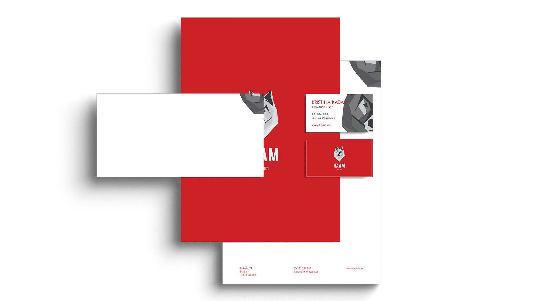
LOGO
GEOMETRICAL WOLF
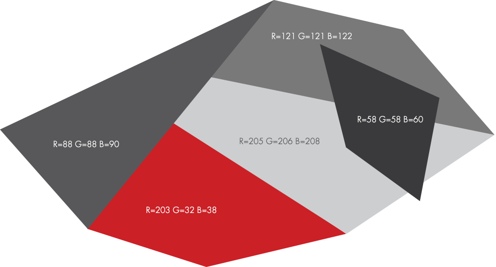
It was the client’s wish that the identity should have a wolf symbol of some kind. I wanted the wolf to indicate the fact that HAAM is a construction company. It has to look faceted and solid. That’s why the logo was drawn in geometrical shapes. It’s the first time I’ve created a logo that consists of more than two colors. In this case, four different grays were used to make it spatial. In addition to the original gray wolf, a white wolf alternative was made.
IDENTITY
DARK AND MASCULINE
HAAM’s identity is dark, masculine and faceted. But we didn’t want the identity to feel too dark and gloomy and that’s why a contrasting colour of bright red is added which complements the gray colour scheme beautifully.

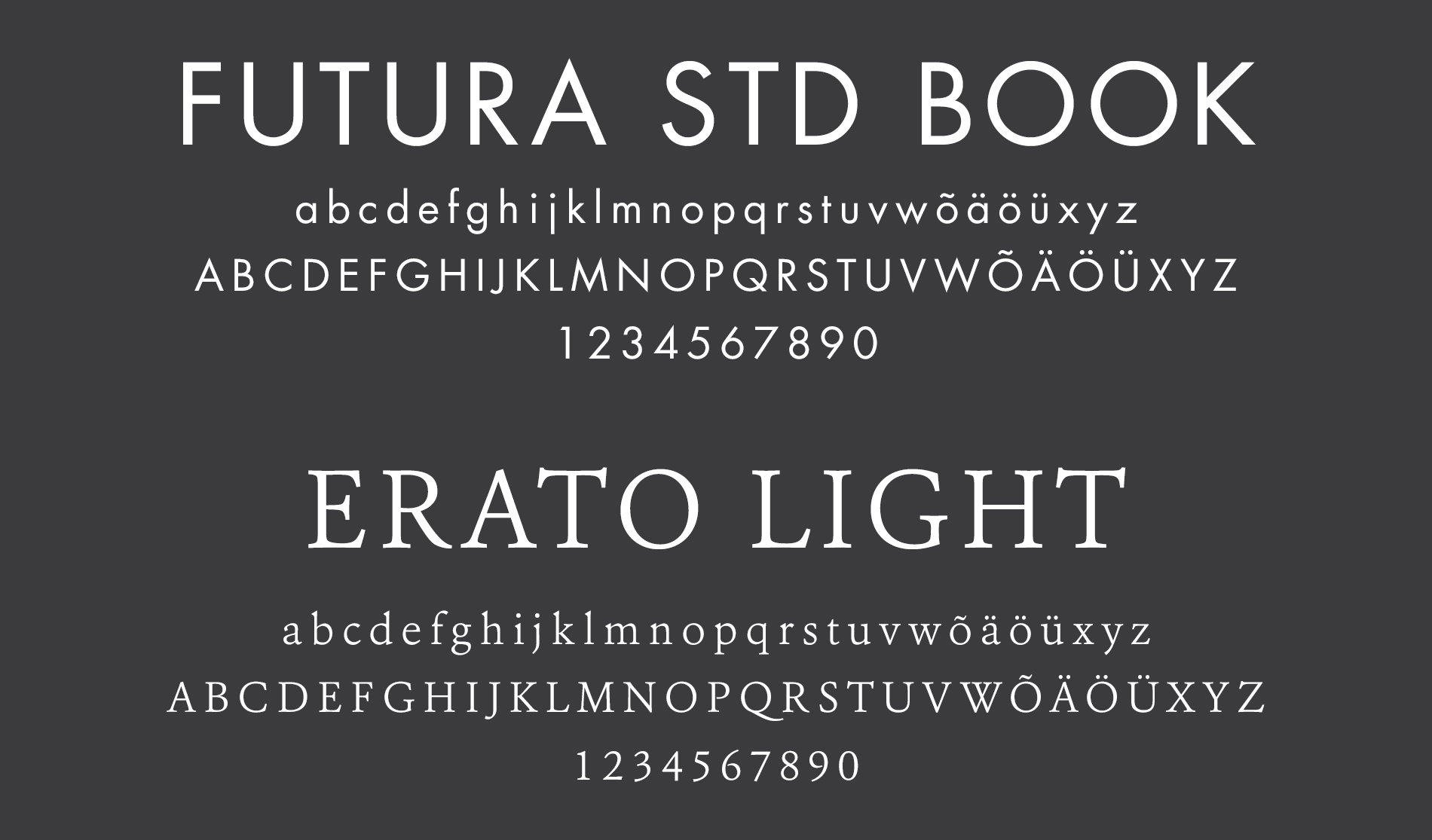
TYPOGRAPHY
FUTURA STD AND ERATO
HAAM's main typeface is Futura Std Book, which was designed in 1927. This classic geometric sans serif type suits well with HAAM's modern and masculine identity. Erato Classic was designed in 2011 and it's a nice complement to the main typeface of HAAM. Erato is used in submenus, blockquotes etc.


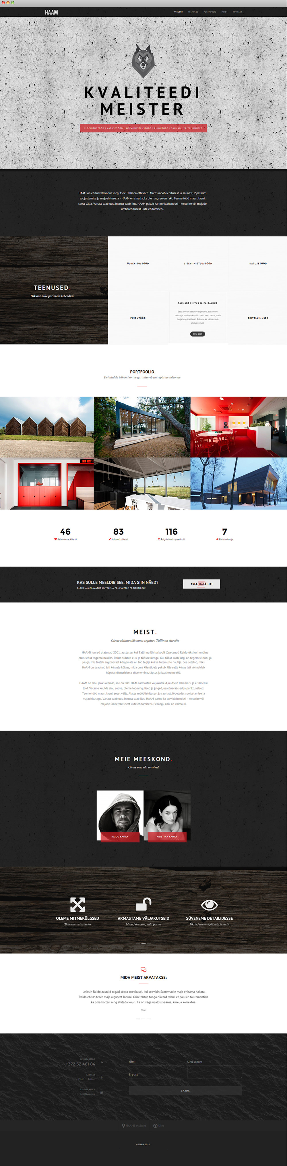
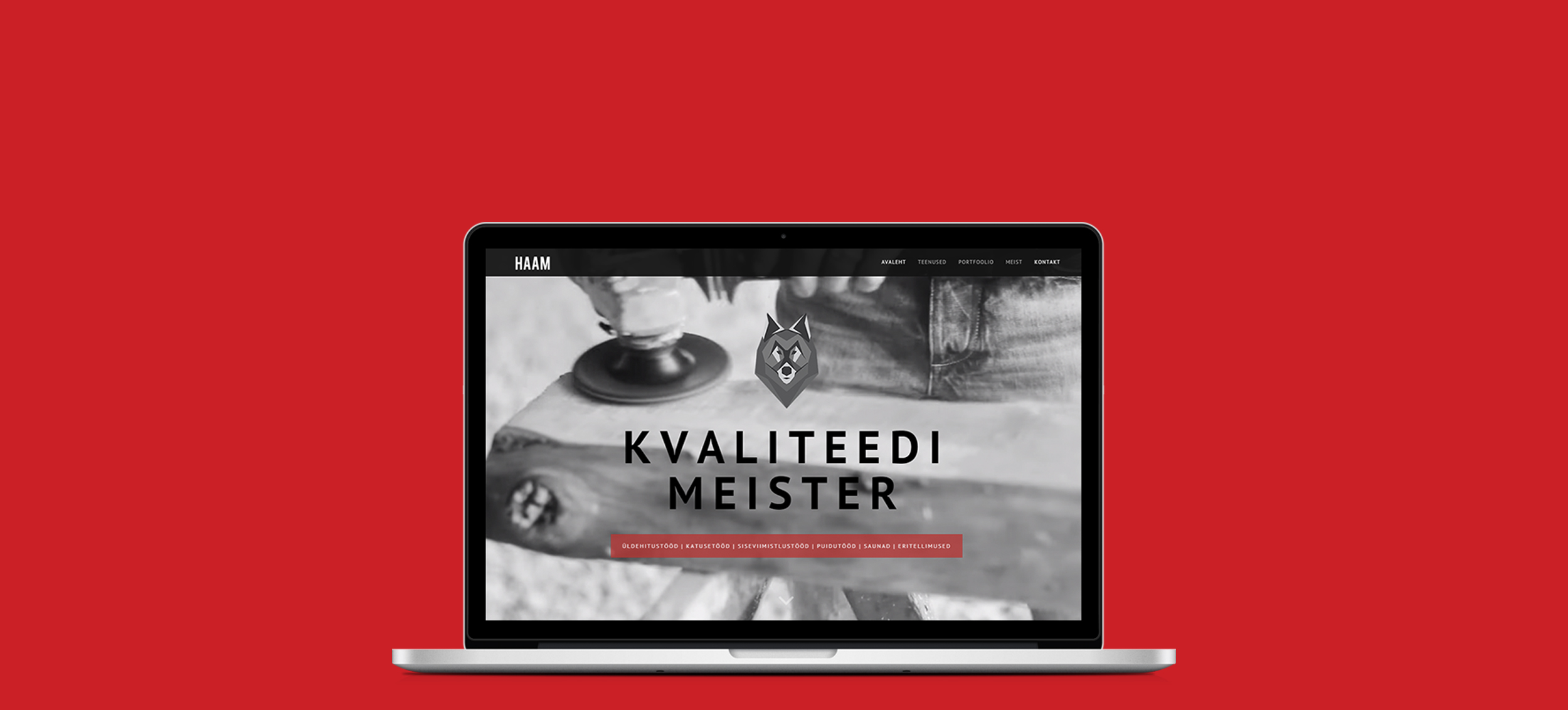
WEBSITE
A SINGLE PAGE WEBSITE
HAAM's website design follows its identity. It is dark and bright red colour brings contrast to the overall colour scheme. A full screen background video is used on the homepage to show a working process of an exceptional craftsman. The main focus of the web page is on the portfolio where every project is carefully and thouroughly presented. Of course all other necessary information, such as services and contact information, is presented on this clean and minimalistic website.

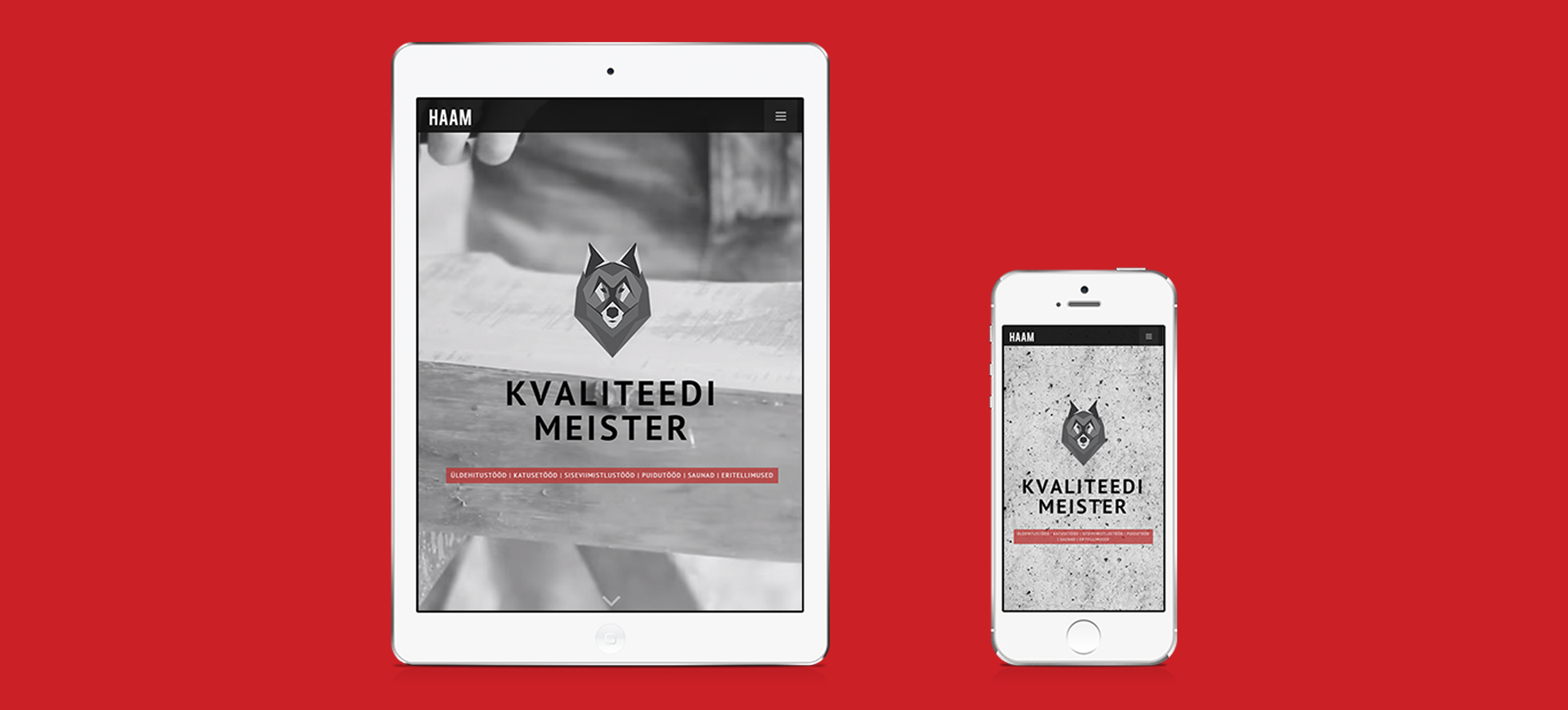
FITS ALL SCREENS
Featuring full responsive behaviour makes this website available on any screen. Smooth transitions between desktop, tablet and mobile ensure a clean and easy to navigate experience. This pixel perfect website is exeeds today’s standards.

ROLE: Illustration + Photography + Videography + Content Creation + Web Design
VIEW PAGE: ...under development