


LASERING
ICON AND UI DESIGN
Lasering is one of the oldest active record stores in Estonia with their first shop opened in 1994. Since then it has been a leading specialist retailer of music, film and games, offering a wide selection of new releases and catalogue titles. Currently Lasering has one shop in Tallinn and an online store which is being redesigned.
ROLE:
Icon Design
UI Design
AGENCY:
YUGEN
CLIENT:
Lasering
YEAR:
2017

CONCEPT
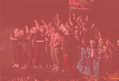
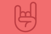
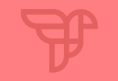
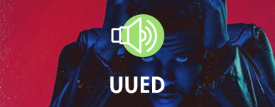
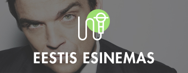
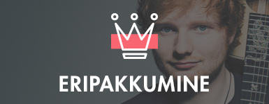
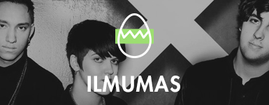
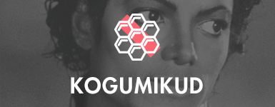
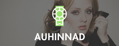
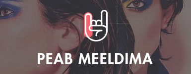
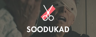
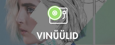
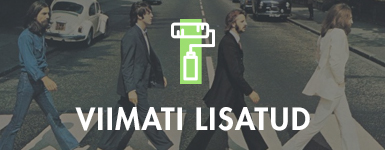
Lasering was working on their new website and they asked me to design their home page's category / banner sections. The categories are as follows: New, Top, Estonian, For Kids, Vinyls, On Sale, Coming Soon, Latest Additions, Special Offers, Awarded, Gotta Like!, While Playing, Christmas, Collections, Gigs in Estonia.
I came up with the idea of creating an icon set for all the categories. Combining meaningful icons with beautiful product design will result in a good looking UI. Client can later also use those icons on any platform they need.


WHY ICONS?
We have 10-12 seconds to grab website visitor’s attention. When we look at the content of a website, especially the home page / landing page, it’s all about readability. How well and quickly can people grasp the main points and how easily can they read and process information. That's where icons come in handy:
• Icons put content in a nutshell
• Icons draw attention
• Icons increase readability
Icons are for bringing essential content to the point. They are great attention grabbers and help visitors find and scan content.
WHAT ARE ICONS?
Those little icons have a big purpose. Like signs which quietly point people in the right direction, icons tell a story, enhance a message and direct the audience to what’s important. Icons are a cross-cultural and silent language in an increasingly noisy world.
MY APPROACH
I'm about to face the daunting task of making a new icon set from scratch. The canvas is empty, nothing is drawn, and I have no idea where to begin. The best way to simplify anything complex is to break it down into easily managed bits of information. By doing that, I can manage an entire set of icons more easily.
1. METAPHORS
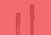
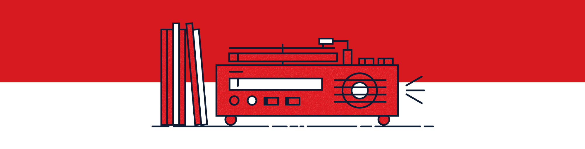
A great approach to relevant icons are metaphors. In my opinion one of the most important things about icons is that you choose metaphors people can relate to. So I started looking for great ones. The client asked for unique metaphors which was a challenging but fun task. How to come up with something unique and universal at the same time? For example, instead of using a record pile for COLLECTIONS category, we went for a honeycomb metaphor.


2. SHAPE
It’s important to be consistent in what shapes to use for each icon. Using similar shapes throughout all icons will strike a balance and bring the entire set together.


3. CONTEXT
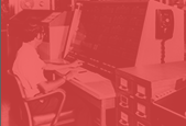
It might seem obvious, but it can be easily overlooked. What type of objects am I using to deliver my message? Using a clock from 1926 and a computer from 2015 may not make a lot of sense and can result in a historically unbalanced set. I was thinking of YOUNG, COOL and ORIGINAL when putting together a list of objects. For example, a tape recorder is an old-fashioned object, but because cassette players are making a come-back, it seems to be a perfect pick.


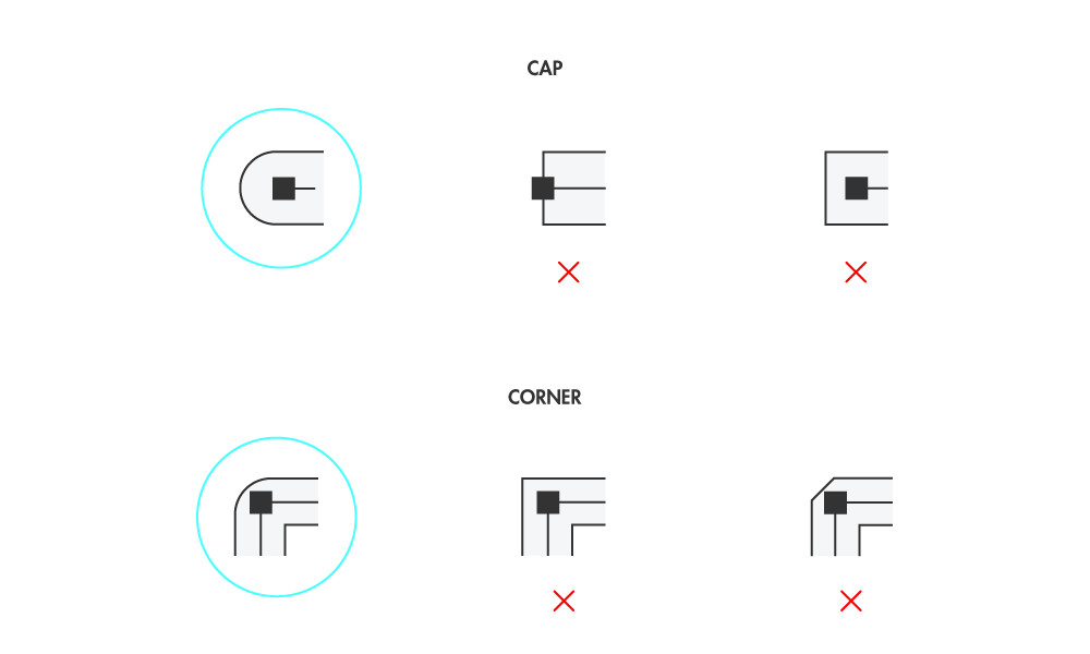
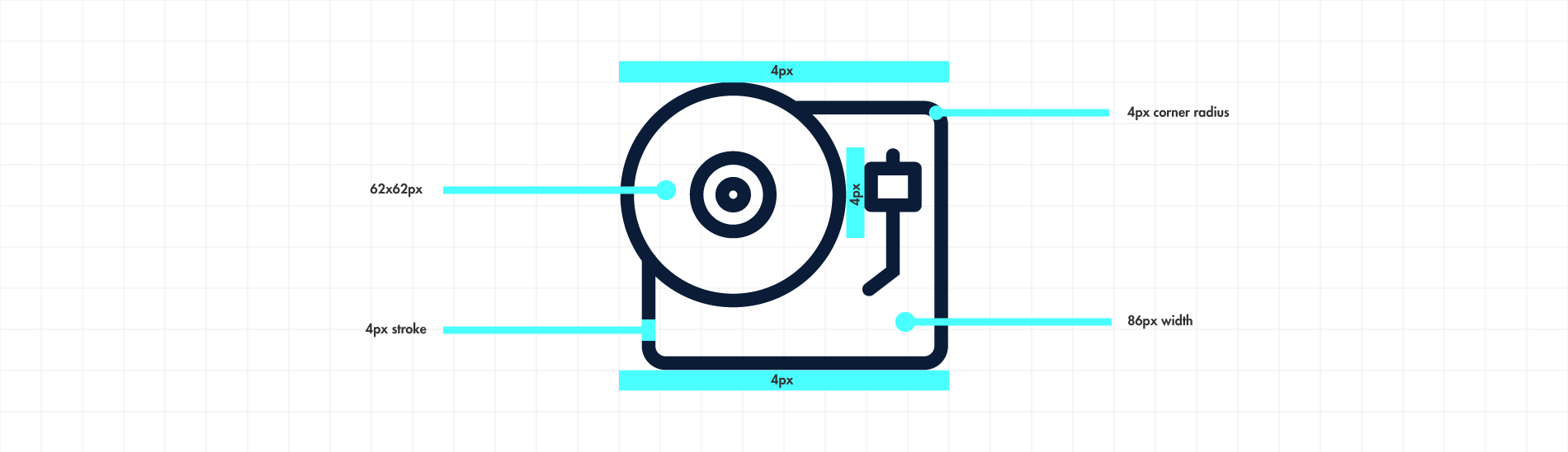
4. CORNER ROUNDING AND CAPS
All corners should use the same amount of rounding and the same type of caps. Even one icon that ignores this rule can create a major imbalance.

5. PIXEL PERFECT AND PROPORTIONAL
Icons are small. Lasering's icons are desgined on a 96x96 pixel grid. It is important that the lines aren't displayed with anti-aliasing. So I've only used whole and even numbers when determining the shape's measurement. When scaling up or down, everything stays crisp and sharp.
Icons should be proportional. The measurements should stay as consistent as possible across every icon, so it is important to think about the height and width of every icon.

6. COLOUR
I started my design with no color. I worked like that until I'd made icons that share a good balance of shape, context, corner rounding, and proportion. Then I added background shapes with colour to the icons in order to make them pop out a bit more and make the identity a bit more youthful. Color shades are based on Lasering's identity (logo and store).
UI DESIGN
When the icon set was ready, I started thinking about the category design on the website. New products should be displayed constantly and the client needs the possibility to manage this content himself.
SOLUTION
Categories have a background image of album covers or other promotional material. There’s a grey filter with adjustable opacity on top of the images. A layer of a reddish colour can be used if a certain category needs to stand out, i.e. special offers, christmas etc.


Thanks for reading & stay awesome!