DOLM IT
I joined the young and cool team of DOLM IT as an UX/UI designer in October of 2016 and the first big thing I started working on was the creation of a new identity for the company. I'm grateful that I had so much creative freedom while doing this.
WEBSITE
CONCEPT
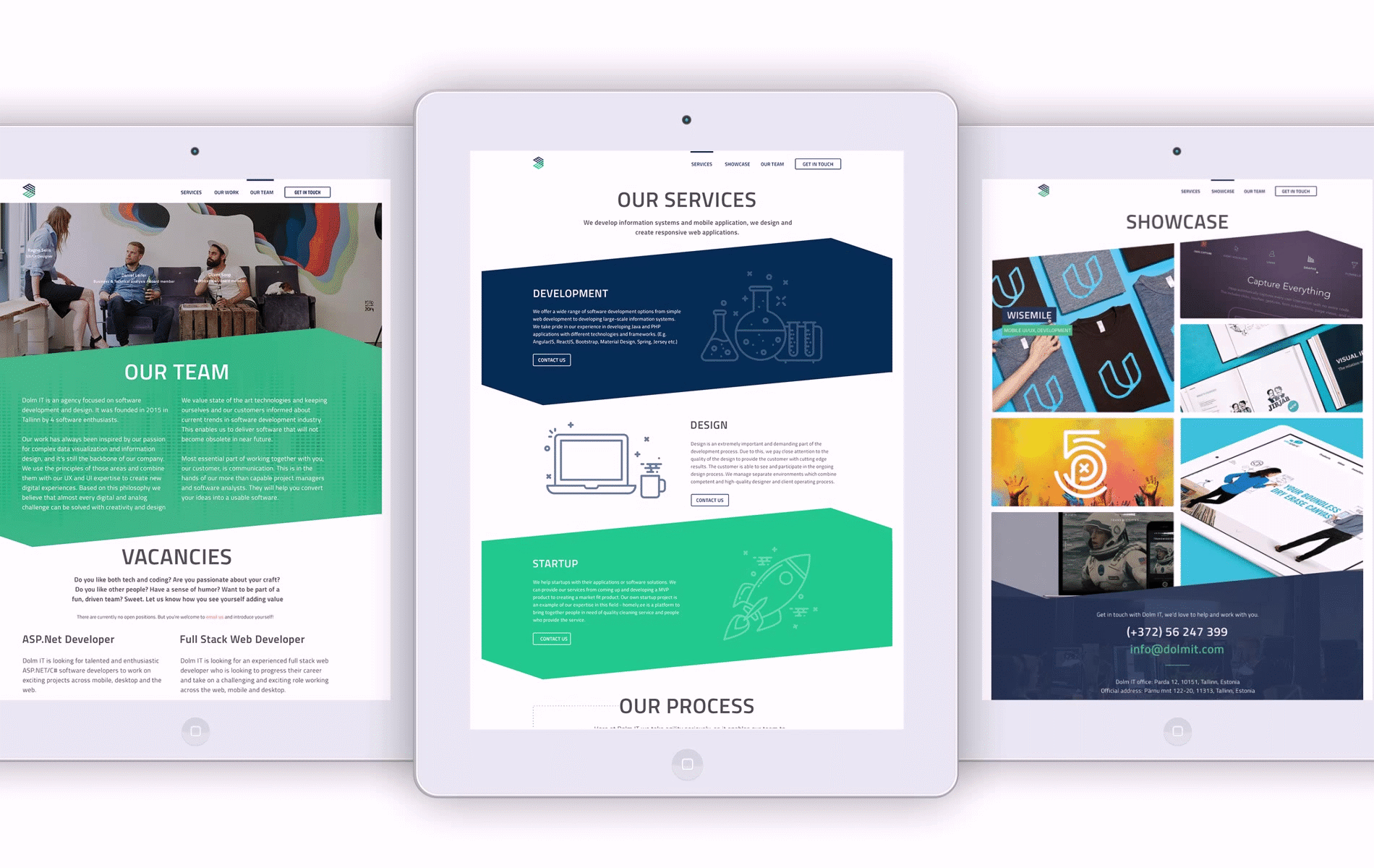
After a few hours of looking at different software development websites, I was suprised that I couldn't find anything really eye-catching and interesting. I was determined to create something that stands out visually without losing any functionality of a decent website. I wanted to use shapes and colours which are manly and suit well in the world of technology and developers. The website's main purpose is to find clients and showcase the work of the team.
I wanted the landing page to look bold and interesting. There's a short intro and two green sections which take the visitor to the two latest showcases in the portfolio.
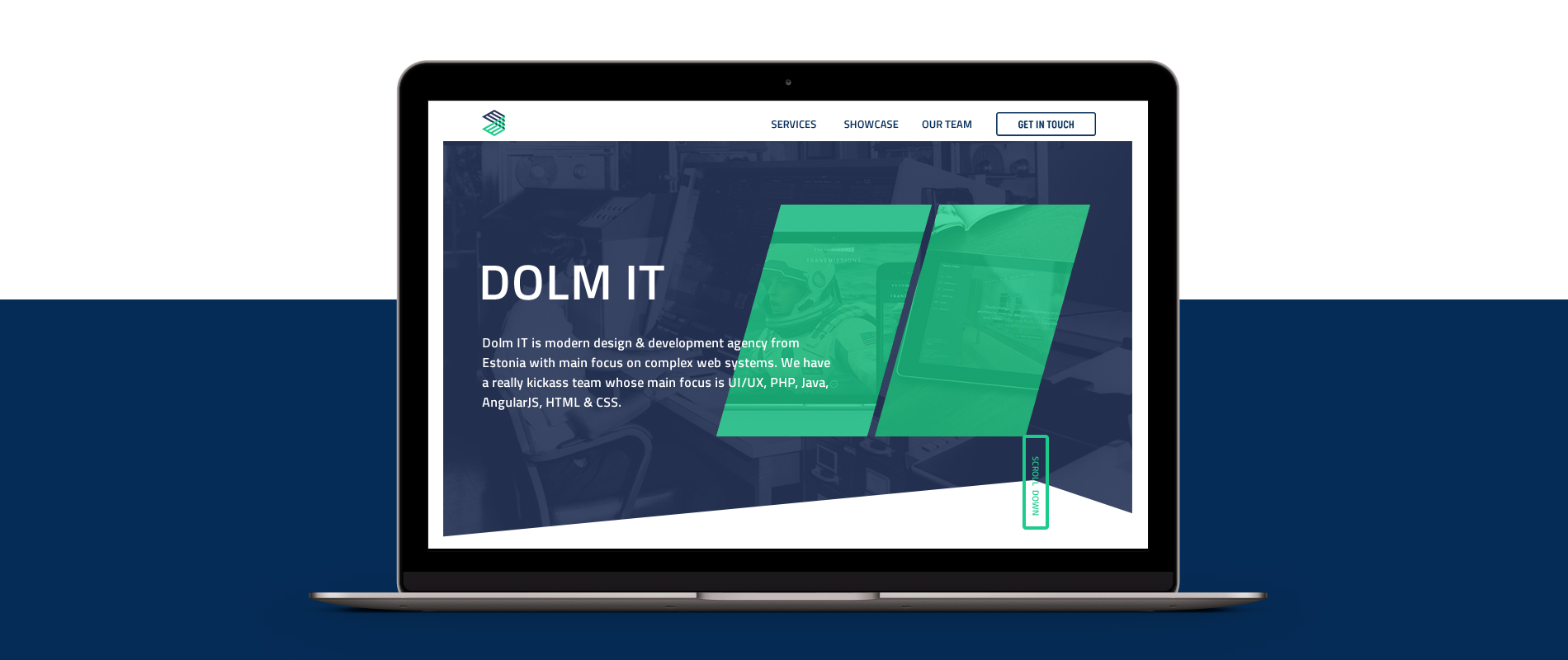

This is how the home page looks like (I'm especially proud of the footer section!):
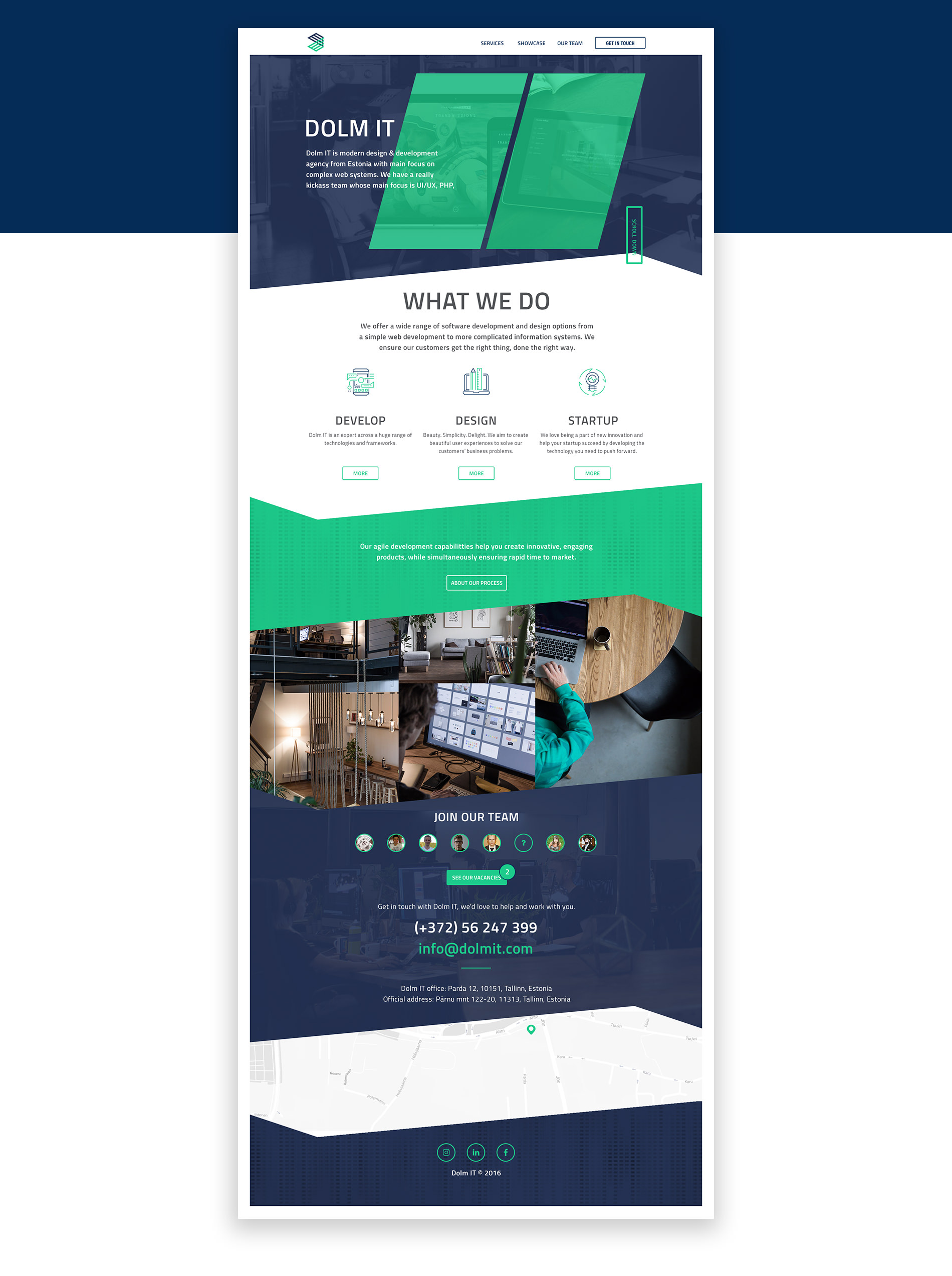

There are three subpages. SERVICES, obiously, represents all the services the company offers, but on that subpage, we wanted to show what DOLM IT's work process looks like. I tried to visualize the agile software development process in attractive and cool way, so that the less tech savvy user doesn't get overwhelmed by the long techinical texts. SHOWCASE is all about showing the good work the team has produced. OUR TEAM presents our people but there's also a section for vacancies, in case we're a looking for a new co-worker.

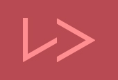
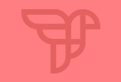
LOGO
ABSTRACT AND MASCULINE
The idea behind the logo was that it should definitely be something abstract, faceted and masculine, so that it would complement the technological world perfectly. At that stage, we didn't have to pick out the colours because we did that already when I started designing the website. I drew six different versions for the logo and this is the one we finally went for. Look at this beautiful birth of the DOLM IT logo! :)
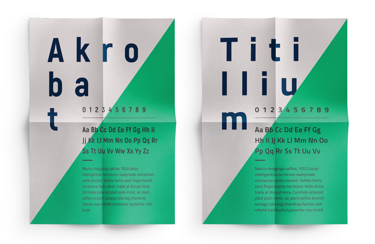
TYPOGRAPHY
AKROBAT & TITILLIUM
The typeface I chose for DOLM IT is called Akrobat and it's a modern sans serif with condensed proportions. It comes with a geometric aestetics and slight neo-grotesque characteristic. I looks good in print, headlines, logos, typographic compositions and short paragraphs of text. Unfortunately it doesn't work so well on web and that's why I picked another super cool typeface, Titillium, for the digital world. I can honestly say that thanks to those two typefaces my love for typography grew stronger.

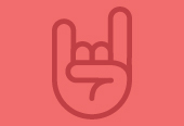
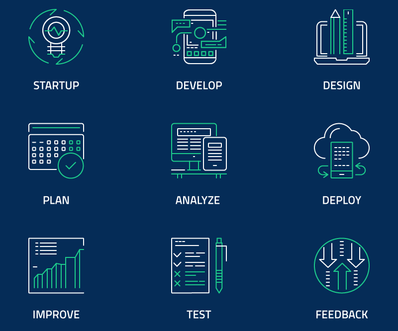
ICONOGRAPHY
DOLM IT SYMBOLOGY
I created 9 icons which we needed to use on our website. Later on, these will be used in marketing medium as well.

ROLE: Web Design + Illustration + Videography + HTML/CSS
VIEW PAGE: @dolmit