


Steelcore
Team
Role
Research, Product Strategy, Business Strategy, Lean Branding, Product Design, UX Writing, Design Systems
Overview
Steelcore is a company dedicated to helping people prepare for any crisis, whether they are military personnel or civilians. Many people struggle with preparedness because they don't know what gear they need or where to start. The app is built around one core idea: gear readiness starts with smart list building.
Users create equipment lists tailored to specific missions or scenarios (like military deployment, rescue work or survival). The system then shows how complete the list is and suggests missing gear to help them reach full readiness. The way users build their gear lists on Steelcore actually mirrors how it’s done in the military: structured, intentional, and mission-ready.
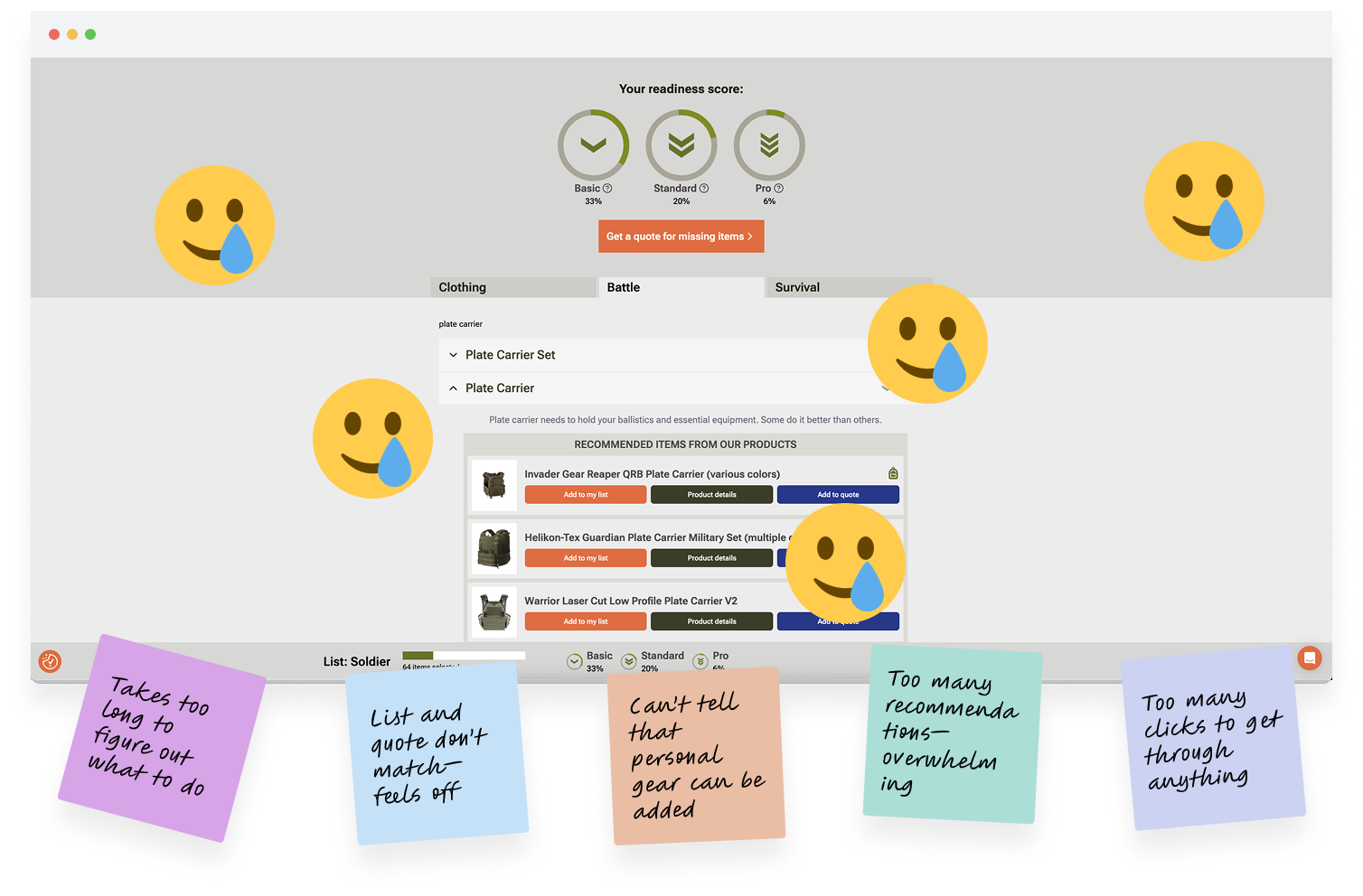
Before I joined, Steelcore had worked with a development agency to create a basic MVP but users found it hard to use. Onboarding was unclear, lists were overwhelming and navigation was messy. People didn’t understand the purpose of readiness scores or how to move through the app.
Steelcore realized they needed outside help. That’s when they brought me in to help define a clearer direction and improve the overall experience.
Strategy & Collaboration Plan
To make meaningful progress, we needed more than just UI fixes. I needed clarity on what problems we were solving, who we were solving them for and how to move forward with focus. When I join a project like this, I never jump straight into design. First, I step back to look at the whole picture:
- What's holding the product back?
- What are users struggling with?
- What outcomes does the business actually need?
That thinking shaped how I proposed we work together, through a structured, three-phase collaboration. Each phase had its own focus, deliverables and purpose. It wasn’t about rushing into solutions but about aligning early, making smart decisions and delivering strategically.
This was my proposal and the 3-phase collaboration plan that guided our work:
Phase 1: Discovery
We kicked things off with alignment. The goal was to uncover the root problems, understand user needs and define what success actually looks like for both the product and the business.
Steelcore had already conducted several interviews before I joined and those gave us a solid head start. Users didn’t understand what the app was for or how to get started. Onboarding felt unclear. The navigation was confusing, lists were a mess and features like the readiness score didn’t make sense:
“It took me 10–15 minutes just to figure out what I’m supposed to do and what this app is even for. The idea is good, but it’s just not clear.”
I reviewed those insights, added my own UX audit of the current MVP, and ran a collaborative workshop to clarify the core problem, map Jobs to Be Done and gather ideas for competitive differentiation.
Phase 2: Strategy
With a clearer picture, I defined what we should focus on and what to leave out. The goal here wasn’t to redesign everything, but to prioritize what actually mattered. That meant narrowing in on the features that aligned with user needs, business goals and the realities of a focused MVP.
To set a clear foundation for the next phase, I:
- Prioritized features based on user needs and business goals
- Mapped out 10–15 essential screens to guide UI and UX work
- Delivered actionable recommendations to refine core flows
- Identified Steelcore’s positioning and value prop to inform the design tone
Phase 3: Implementation
Once the foundation was clear, it was time to bring everything to life through clean, scalable design. This phase was all about turning strategy into tangible, high-quality outputs the team could build on, not just now, but as the product grows.
To set a clear foundation for the next phase, I:
- Designed low-fidelity wireframes to shape structure and flow
- Defined lean branding to match Steelcore’s voice
- Built a simple Figma design system with reusable components and styles
- Created a full visual overhaul with a new, scalable UI
- Prepared handoff-ready files for development and future iteration
Research fan? Take a look at the process
Phase 1: Discovery
We began by reviewing several user interviews that the team had already conducted. These weren’t perfect, but they gave us a head start. Users expressed confusion from the moment they opened the app—many didn’t understand what the platform was meant to do or how to even begin. The onboarding process was vague, the navigation was rigid and didn’t follow their mental model and the concept of readiness scores left people scratching their heads. There was also a mismatch between the gear lists and the quote-building feature, which felt disconnected and unclear.
To build on that, I ran a structured discovery workshop with the founders. We used it to zoom out and define the strategic foundation that had been missing. Rather than jumping to solutions, we asked: What exactly is the product trying to solve and for whom?
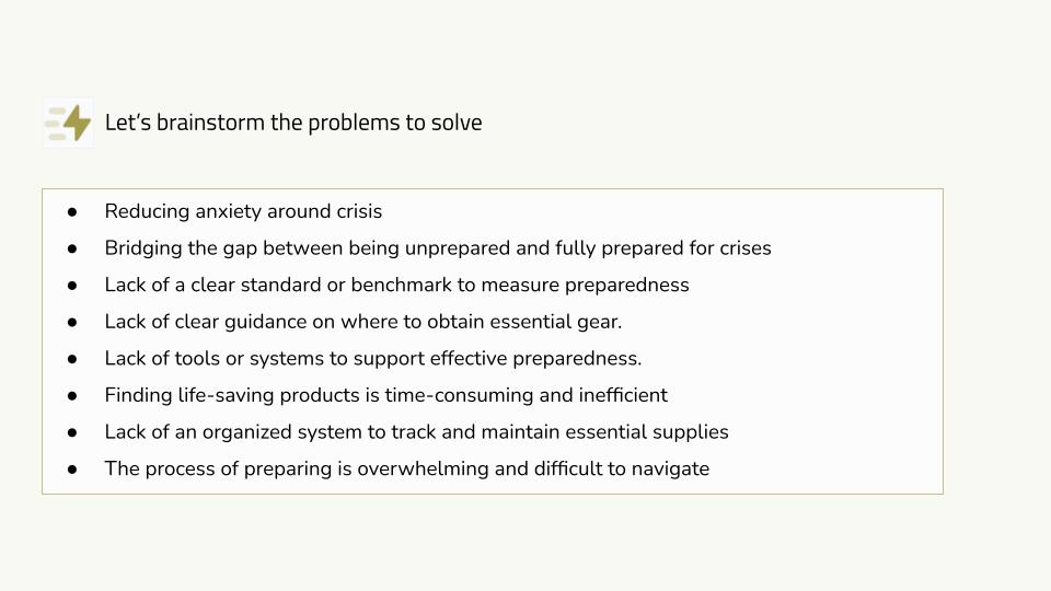
The problem statement we defined together became this:
“People want to feel prepared for any situation, but most don’t know what gear they need, where to begin, or how to stay organized. Steelcore should guide them step by step and help them build personalized gear lists with confidence.”
This simple sentence helped anchor all our decisions moving forward.
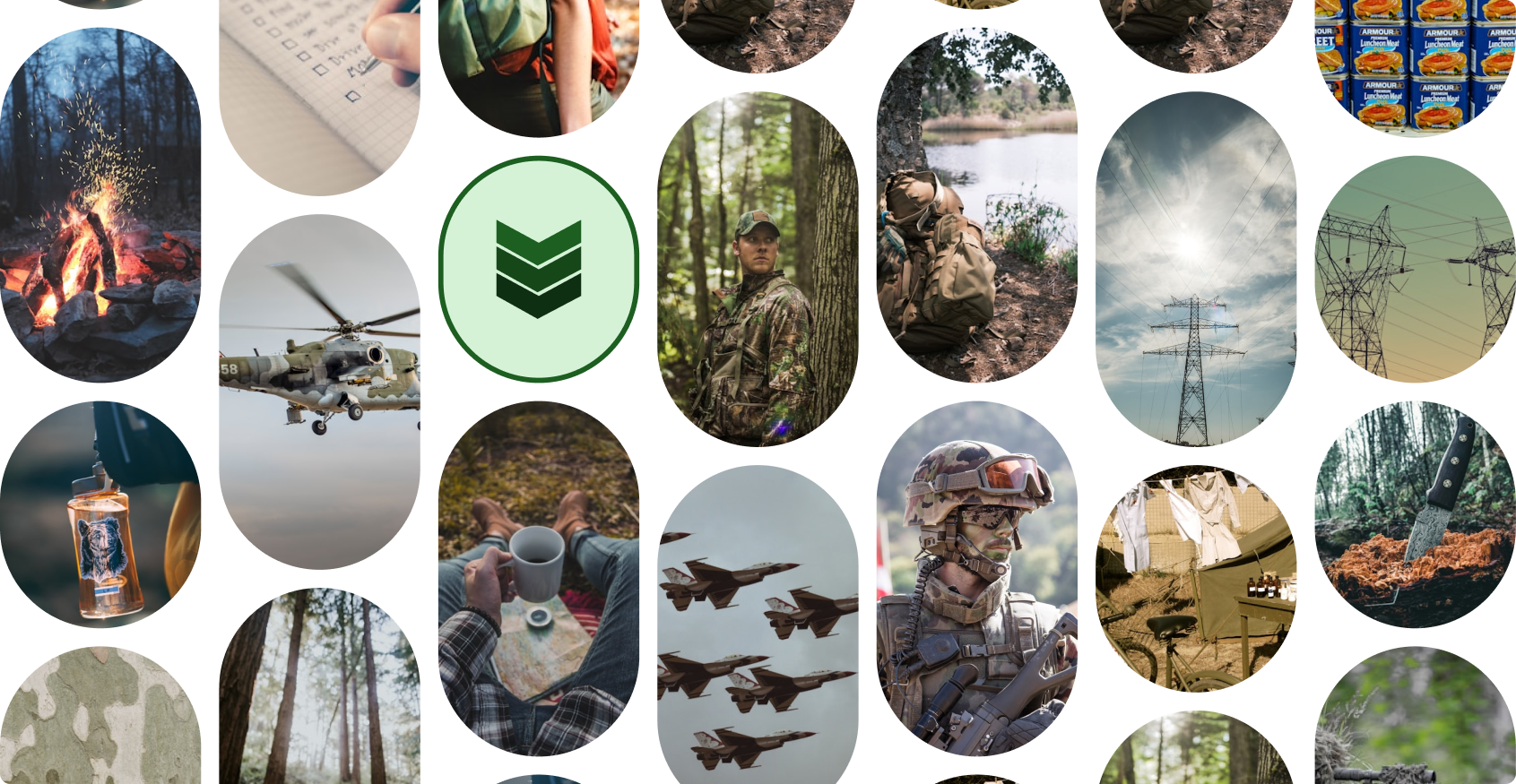
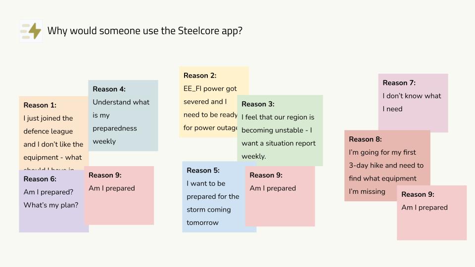
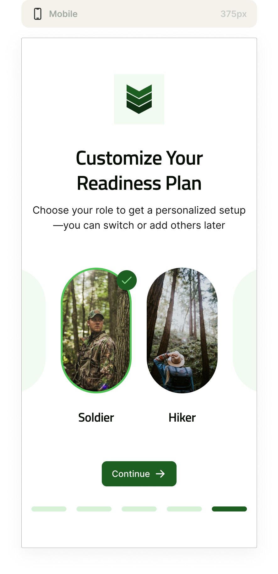
Next, we mapped out the core user groups. These included both civilians and professionals like military personnel, law enforcement and security contractors. While their contexts varied, their struggles were similar: they all wanted to feel prepared and in control, but lacked a clear system. We outlined three key personas to represent these needs—each with its own goals, frustrations and JTBDs (Jobs to Be Done). Across all of them, we found one big thing in common: they didn’t just need gear—they needed clarity.
We unpacked those jobs in detail, identifying both functional and emotional drivers. Functionally, users wanted to know what to bring, how to organize it and what was still missing. Emotionally, they wanted to feel capable and calm in high-stress or unknown scenarios. That insight reframed our thinking around how we approached guidance, lists and even how feedback was presented inside the product.
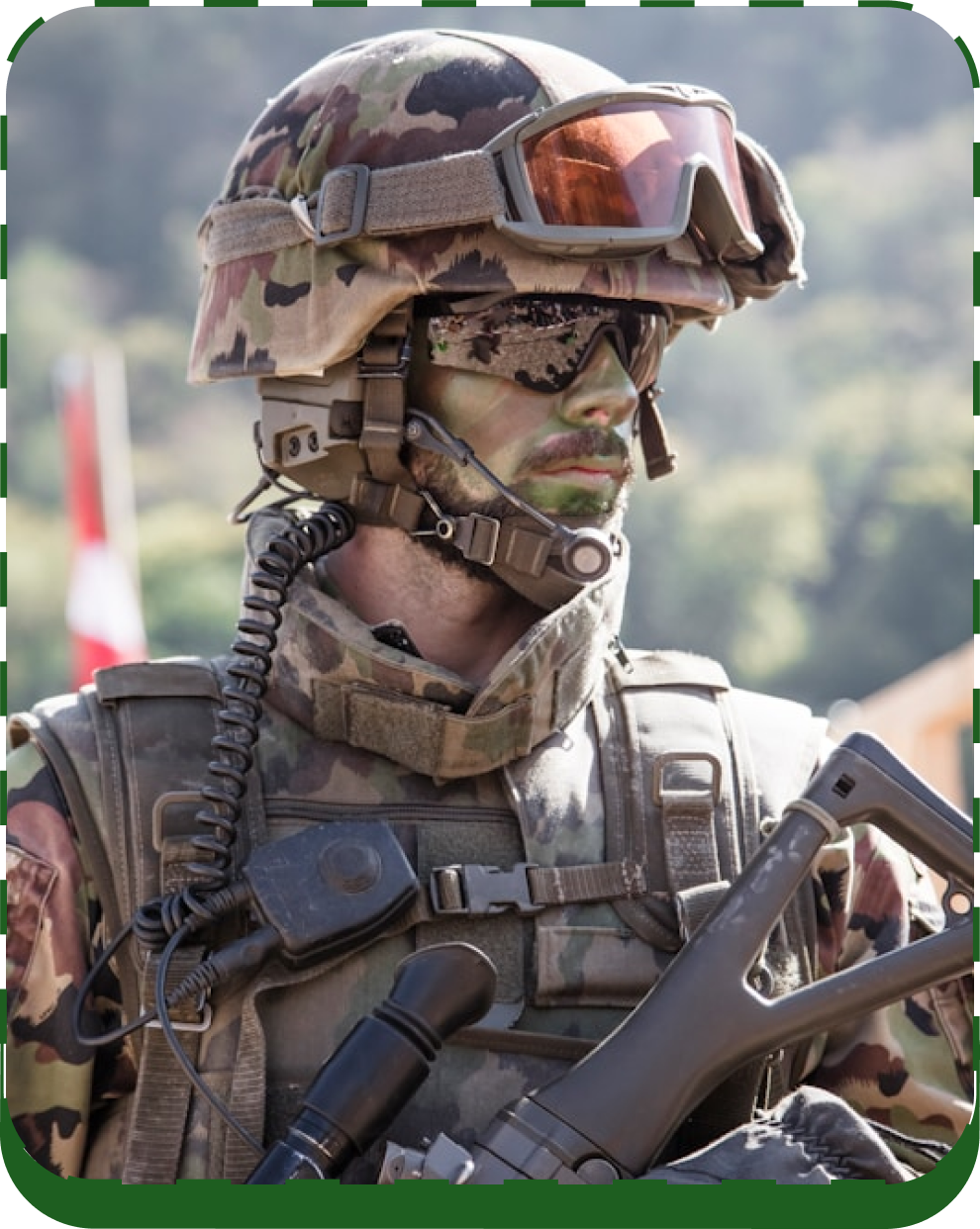
The Soldier
Motivations: To be fully prepared and ready to face any crisis or wartime situation.
Goals: Equip themselves with the right tools and knowledge to succeed. Solve critical problems effectively and “win the war” in their role.
Key Challenge: Unclear what gear to choose and where to get it. Lacking critical info for smart decisions.

The Outdoor Enthusiast
Motivations: To enjoy outdoor adventures while staying safe and comfortable.
Goals: Be fully prepared for hikes, camping trips, or outdoor activities. Ensure they have the right equipment for every situation.
Key Challenge: Unsure what gear fits their needs and how to plan effectively for the outdoors.
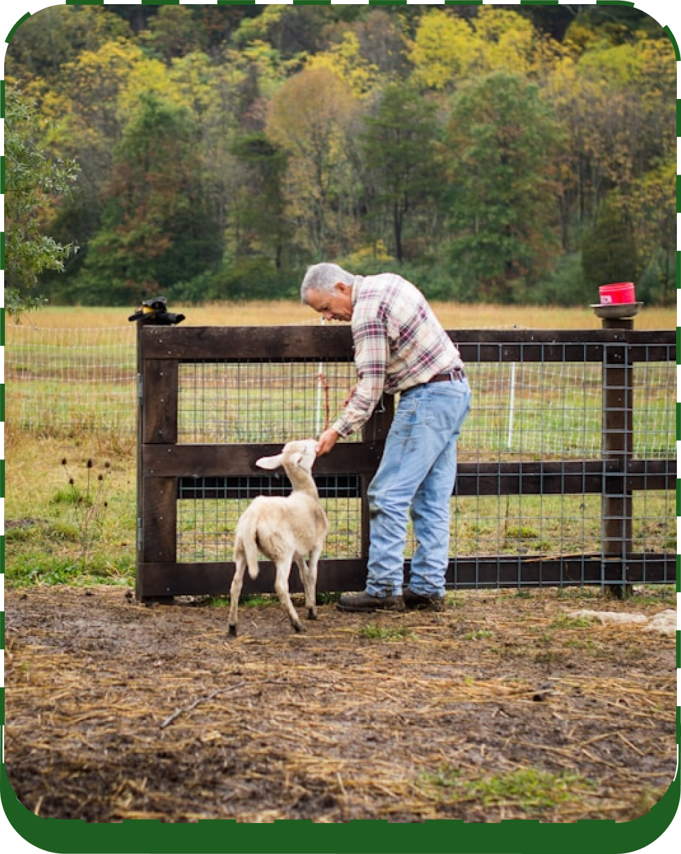
Uncle Bob
Motivations: To reduce anxiety and feel secure about being prepared.
Goals: Take the necessary steps to be ready for crises or unexpected situations. Gain confidence in their preparedness.
Key Challenge: Doesn’t know where to start. Feels overwhelmed and lacks clear guidance.
From there, we ran an affinity mapping session to organize all the insights, complaints and needs that surfaced through interviews and observation. A few consistent pain points stood out: onboarding lacked guidance, the UI structure didn’t match how users think, the readiness score lacked context and quote-building felt like a separate tool entirely. But we also saw real potential—users loved the idea of the app. It just hadn’t been executed in a way that made them feel confident using it.
We also spent time discussing the competitive landscape—not because we wanted to copy anyone, but to identify gaps. Most tools in this space were either product catalogues or hyper-niche planning apps. Steelcore could be different. It had the potential to become a practical, everyday tool for people who want to feel ready, not just shop.
This phase gave us a shared strategic foundation. We walked away with a clear problem statement, a defined user set, JTBDs and a prioritized list of pain points and opportunities. That set the tone for everything we did next.
Phase 2: Strategy
Feature Prioritization & Definition
After aligning on user needs and pain points in Phase 1, I moved into defining what the product actually needed to do—and what kind of experience it should offer.
The MVP Steelcore had originally developed tried to cover a lot, but in doing so, it lost clarity. Users didn’t know where to start, what gear was right for them, or how to move through the experience. My role at this stage was to simplify and prioritize—focusing on the core features that would actually make a difference.
I identified four key areas that needed to be reworked:
- Onboarding — Users were confused from the first click. I proposed a step-by-step intro that explained the purpose of the app and how to get started.
- Readiness — The concept of readiness levels made sense, but lacked context. I recommended a clearer visual and conceptual model to help users understand what it meant to be “ready”—and how to get there.
- Navigation — The original list-based structure felt rigid and overwhelming. I introduced a more flexible, card-based system to allow for a smoother, more modular flow.
- Recommendations — Gear suggestions in the MVP were too vague and too many. I refocused the logic, added contextual product info, and removed noise so users could act with more confidence.
These decisions weren’t made in isolation—they were mapped directly to the Jobs to Be Done and emotional drivers I had uncovered earlier. The result was a feature set that supported user needs while also advancing the business goal: helping users feel fully equipped and in control, without guesswork or stress.
I also helped shape the product vision itself. The founders wanted the product to feel like a mix of a dashboard and an online shop—something that still showed its e-commerce roots but felt more structured and focused on planning. That framing made total sense—the product was born out of their original e-commerce shop, and that DNA was still important. But instead of just helping people buy gear, I saw Steelcore as a tool for helping people prepare. It needed the structure and guidance of a dashboard while keeping the immediacy and usability of a shop interface.
One of the most exciting future-facing ideas I proposed during this phase was a visual, avatar-based gear list builder. Inspired by familiar interfaces like Instagram’s avatar customization, the concept lets users assemble their gear lists by interacting with a central figure—a soldier or civilian avatar. Below the avatar, categories like clothing, tools, medical, or tech would appear, allowing users to intuitively build and preview their lists piece by piece.
This approach blends a sense of personalization with practical utility—turning abstract readiness into something people can actually see and shape. The rest of the team was especially enthusiastic about this idea and expressed interest in implementing it ASAP.
While it’s not part of the current MVP, this concept helps set a longer-term vision for Steelcore—bridging the familiarity of e-commerce with the structure and purpose of military preparedness.
Everything I defined in this phase was designed to scale—not just across screens, but across user types. Whether the user was a soldier preparing for deployment or a civilian trying to build a crisis-ready go-bag, the experience needed to feel consistent, responsive, and tailored.
This phase clarified what mattered, what could wait, and what kind of product we were really building.
Strategic Design Recommendations
Once I had clarity on what to prioritize, I moved into defining how those features should actually work. The MVP needed more than visual tweaks—it needed a shift in logic, structure, and usability. I created detailed design recommendations that translated strategy into real, actionable steps for the next iteration.
The onboarding flow became a top priority. I proposed replacing the generic, one-screen intro with a card-based walkthrough that would ease users into the platform. It would explain core concepts like readiness scores, guided gear selection, and navigation—using progress bars, overlays, and tooltips to create a sense of clarity and orientation from the start.
The readiness system also needed a complete rethink. Instead of just showing a score, I suggested visual progress trackers and contextual explanations: What does “Pro readiness” actually mean? How can users get there? I recommended embedding this feedback directly into the dashboard.
For navigation, I recommended moving away from the rigid, accordion-style flow that dominated the MVP. Instead, users would interact with cards and tiles—starting with high-level categories like “Clothing” or “Survival,” then drilling down into subcategories like “Head” or “Neck” only as needed. This progressive disclosure pattern would reduce cognitive load and make the experience feel lighter and more interactive.
At this point, I also revisited the avatar-based gear builder idea. While it wasn’t feasible for the MVP, I outlined how it could be phased in over time as a complementary layer. Imagine a user selecting a helmet not from a menu, but by clicking on the “head” of a soldier avatar. It’s a familiar interaction pattern—borrowed from gaming and social platforms—but used here with real-world purpose. The avatar wouldn’t replace the card system, but it would give users a visual, tactile way to build their lists, get feedback, and feel in control of their preparedness.
These recommendations shaped the roadmap for the next iteration. I wasn’t just defining features—I was mapping out how the experience should unfold, from onboarding to gear selection to motivational progress nudges like “You’re 80% ready.” The goal was to make the product feel coherent, guided, and purposeful—even before touching a single pixel in the UI.
Market Positioning & Differentiation
As a final step in this phase, I mapped out Steelcore’s competitive landscape to make sure our decisions weren’t happening in a vacuum. There are plenty of apps in the preparedness space—some with kit-building tools, others with tactical gear—but none that deliver a guided, personalized, and structured experience from start to finish.
Apps like Preppr offered prepping plans and inventory features, but lacked real-time readiness tracking or military-specific utility. Platforms like Bug Out Bag Builder made gear selection easy, but focused only on physical items and offered no onboarding or strategic flow. Niche tools like Ultimate Survival Tips had impressive tactical gear, but didn’t offer a cohesive or modern digital experience.
In contrast, I positioned Steelcore as a hybrid between dashboard logic and e-commerce usability—built to serve both military and civilian users. While competitors targeted hobbyists or survivalists, I wanted Steelcore to offer something broader: a calm, structured, confidence-building experience focused on real-world clarity, not just gear.
This analysis also validated the product’s potential to evolve—layering in AI-powered suggestions, mobile responsiveness, offline capabilities, and adaptive recommendations as users grow. But first, the foundation had to be clear: we weren’t building a gear store. We were building a readiness system.
That clarity gave the implementation phase a strong north star to follow.
Bringing It to Life
Once the foundation was in place, I began shaping the actual interface translating strategy into UI decisions that directly addressed the most urgent MVP pain points. Every element was designed to support clarity, momentum and real-world usability. Before finalizing the UI, I explored several layout directions in low-fi wireframes to validate the structure and user flow. Once alignment was reached, I moved into visual design. Below are some of the core components that brought the new experience to life, each rooted in user behavior and the product’s hybrid vision of being both a dashboard and an e-commerce tool.
Easy to Follow
The new design helps users understand where to start, what to do next and how to move forward—without needing instructions.
Flexible But Focused
We replaced the old rigid flow with a layout that lets people explore categories one by one, based on what they actually need.
Clear, Not Complicated
Instead of trying to do everything, we focused on making core actions simple—like adding items or checking what’s missing.
Keeps You Moving
The progress scores aren’t just numbers. They’re there to show how ready you are and encourage you to keep going.
Always Know Where You Are
The sidebar stays in place as you build your list. It shows where you are, what’s left and how to finalize your gear.
Planning Meets Purchasing
The UI combines practical planning with tools like filters, pack weight feedback and quote requests—all in one flow.
The UI combines practical planning with tools like filters, pack weight feedback, and quote requests, all in one flow. These principles guided how the interface should actually work. They helped turn strategy into something that feels clear, easy to use and ready for real-life use, even in complex situations.

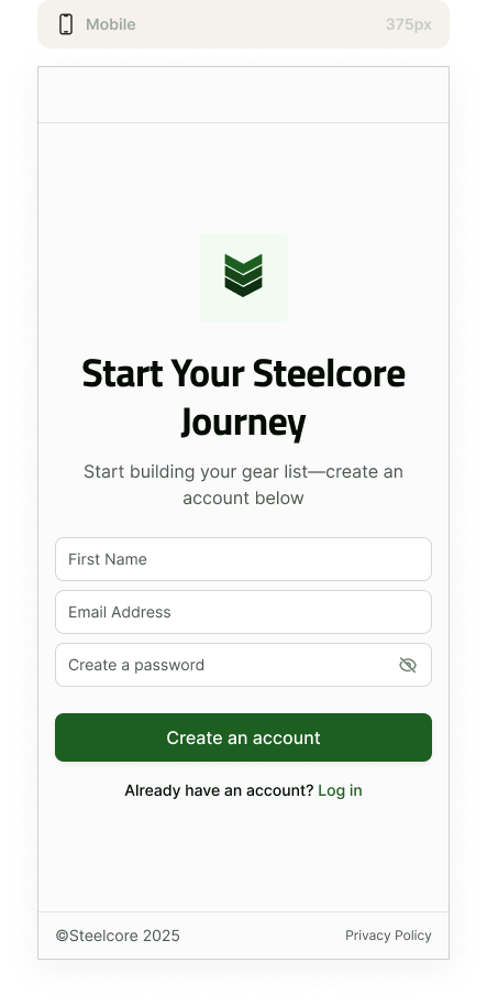
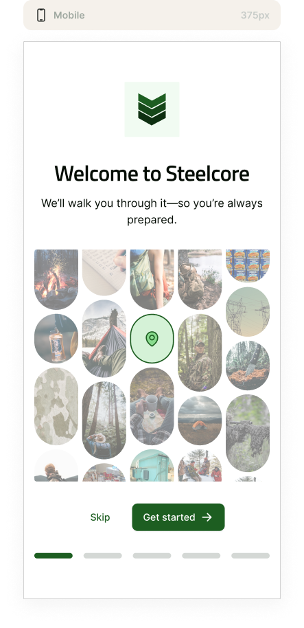
Onboarding Flow
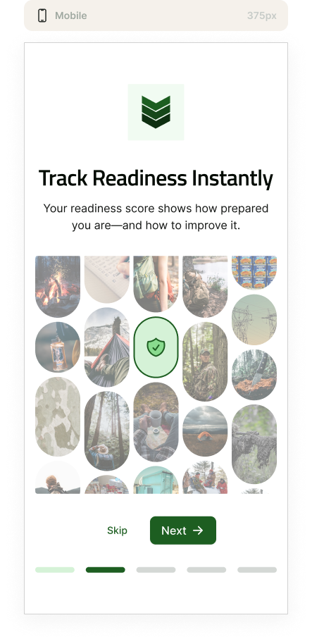
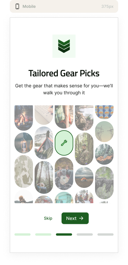
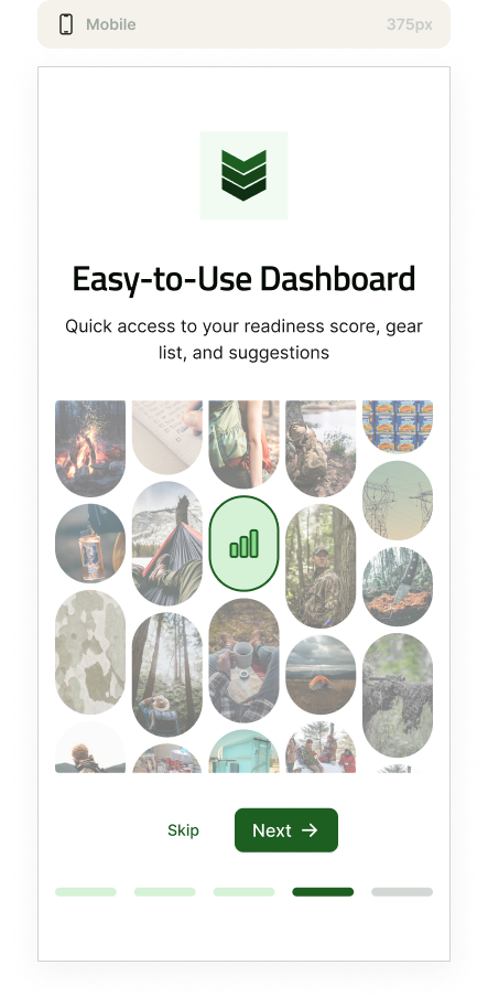
The MVP’s onboarding flow was a major pain point. It didn’t clearly explain the app’s purpose or how to use it. It left new users frustrated and unsure, taking up to 10–15 minutes just to figure out what to do.
In the new design, we completely revamped the onboarding process. Instead of a single static screen, we introduced a 5-step card-based walkthrough that:
- Explains core features like the readiness score
- Guides users through the app’s structure (Clothing, Battle, Survival)
- Provides visual cues (progress bars, tooltips) to create a sense of clarity from the start
This makes the experience feel guided, intentional, and motivating—helping users immediately understand what to do and why.
Sidebar: One Place for Everything That Matters
The sidebar gives users direct access to the three main gear categories: Clothing, Battle, and Survival. Whether someone is prepping as a soldier or hiker, they can quickly jump between areas and build their list in whatever order makes sense for them.
Lower in the sidebar, the “Purchase list” section is always visible/highlighted to reflect how important it is to the entire experience. This is where users check what’s missing and request a quote. It’s the main action in the app, so we made sure it’s never more than a single click away.

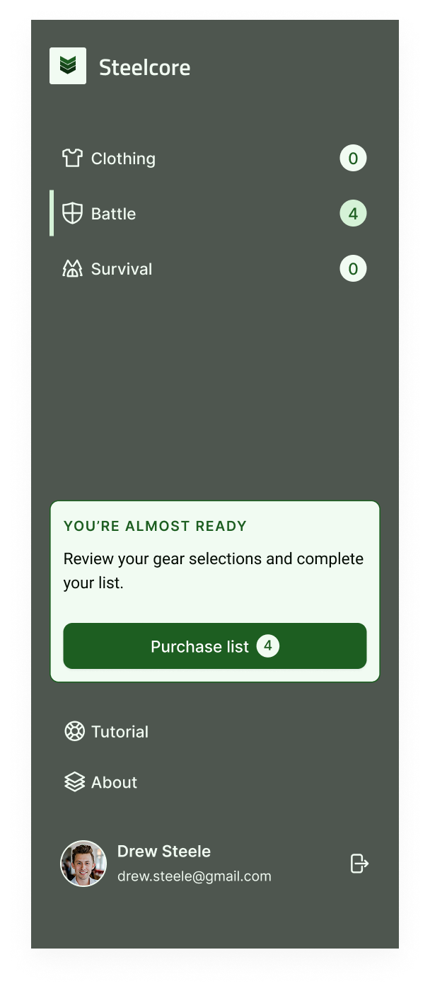
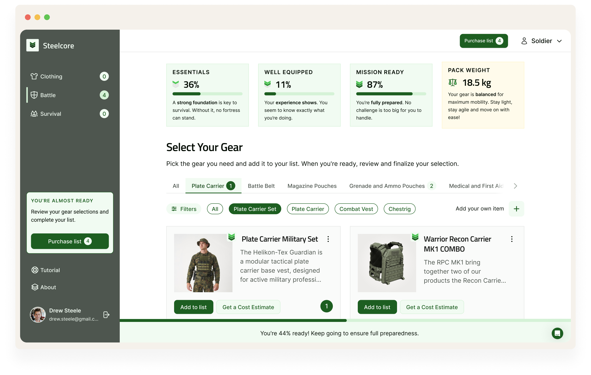
Readiness Score Blocks: Motivation Built In
The readiness system is central to how users understand their progress. Instead of showing a single percentage like in the MVP, we broke it into three clear tiers: Essentials, Well Equipped and Mission Ready. Each block comes with a short description to help users understand what that level means and how to improve.
It’s not just a score, it’s feedback. The goal was to make readiness feel motivating rather than overwhelming, especially for users who are new or unsure.
The fourth block is designed for contextual insights. In this example, it highlights pack weight to help users stay agile and balanced, but it can adapt to surface any other metric or information we want to bring attention to. It’s a flexible space that can grow into a richer dashboard experience as the product evolves.


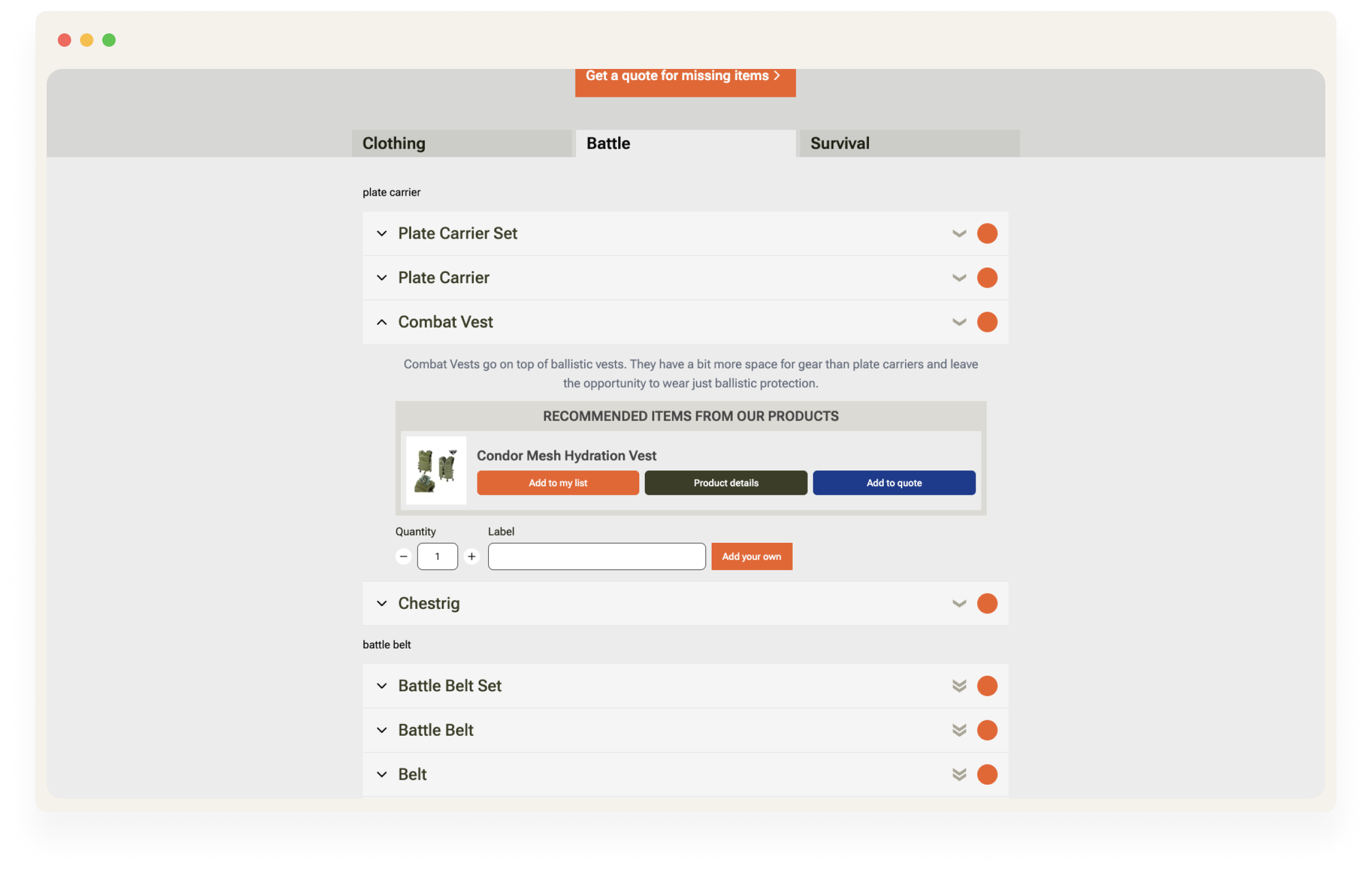
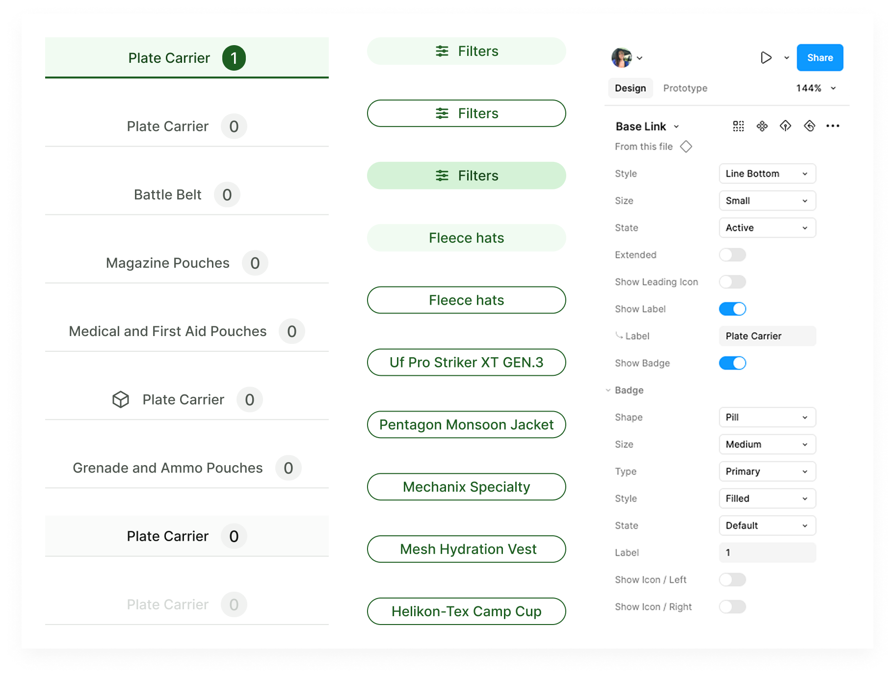
Category Navigation: From Chaos to Clarity
In the old version, users had to scroll through a massive accordion list with every gear item expanded by default. It was cluttered, hard to scan, and mentally exhausting.
In the redesign, I introduced top-level navigation based on gear type: Head, Neck, Underwear, etc. These are grouped under high-level categories like Clothing, Battle, and Survival, mirroring how people naturally think when packing for a mission or field exercise.
Inside each category, users can fine-tune their view using simple filters and tag chips like “Battle Belt” or “Merino.” These dynamic components, built as part of a scalable design system, adapt to size, state and context. It’s a lighter, more focused way to navigate and a huge improvement over the MVP’s one-size-fits-all list.
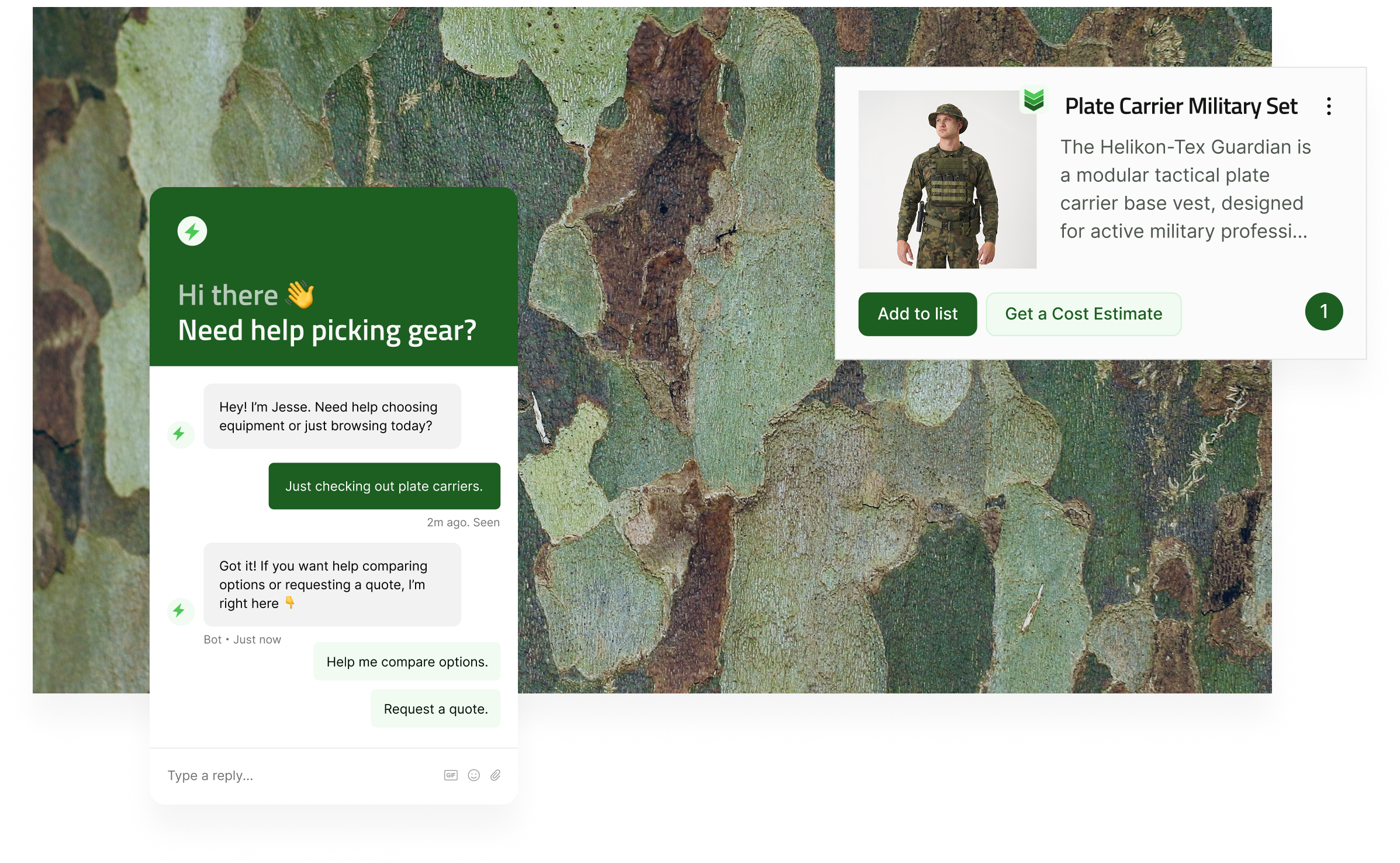
Product Cards: Focused and Field-Ready
This was designed as a minimum viable solution: simple, clear and built around the two most important actions: adding to gear lists and requesting a quote. Each card presents just the essentials: product image, name and key actions, making it easy to scan and act quickly, even in the field.
Instead of building full product detail pages from the start, we decided to link out to the existing e-commerce site for specs and descriptions. It was a pragmatic choice that allowed us to focus on the core user flows first. In future iterations, we plan to bring more of that detail in-app to create a smoother and more cohesive experience.
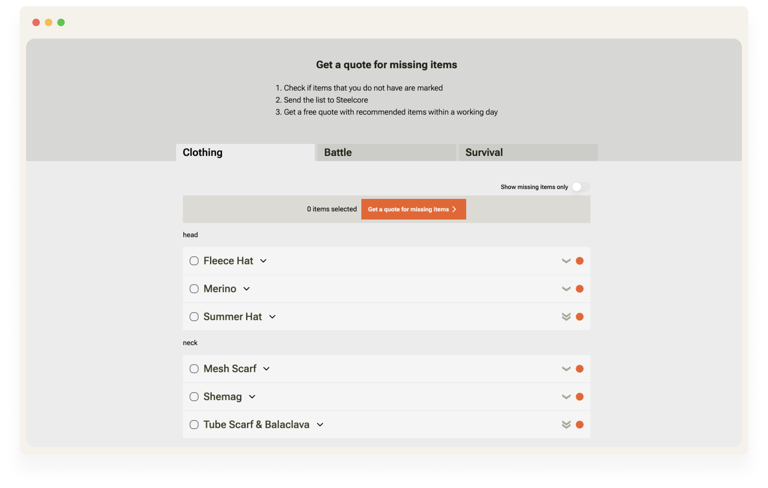
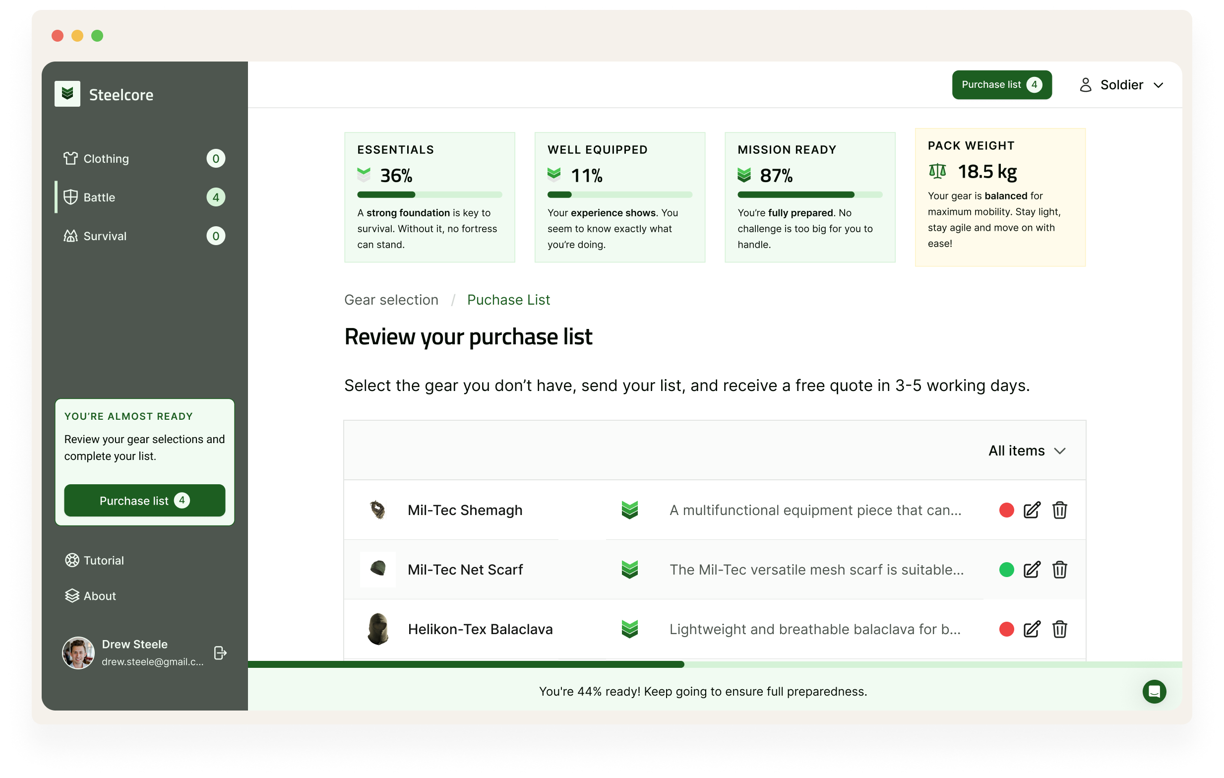
Final List View: MVP Simplicity, Built for Action
This is the MVP version of the Purchase List view—clean, minimal and built around the core workflows: edit, remove and request a quote. At this stage, the product focuses on functionality over features. Users land here after building their gear list to review selected items, make quick adjustments and move forward without friction.
While the interface may appear simple, there’s smart structure behind it. The table shows the user’s current selection across all available gear types, offering a bird’s-eye view of what’s been added, what’s missing and what might need replacing or upgrading. Status indicators help quickly spot action points and all essential actions are available directly within the row.
To help users narrow focus, the MVP includes two basic filter tools:
- “Show only missing” – surfaces gear gaps or upgrade suggestions, reducing noise.
- “Show in order of priority” – reorders items based on what’s most critical to address first (e.g., basic survival needs before optional upgrades).
These light filters are designed to support fast, field-relevant decisions without overcomplicating the interface.
In future iterations, this view will evolve to support more advanced planning and procurement workflows. Planned additions include:
- Search functionality for faster item discovery
- Detailed filtering by gear type, status, or category
- Pricing information and quotes integrated into the table
- Expandable item rows for technical specs or field notes
- User-defined sorting and priority tagging
The goal is to make this list view scale with user needs, from a simple checklist to a robust tool for managing field readiness.
Zooming out, here’s how the full interface supports the bigger picture.
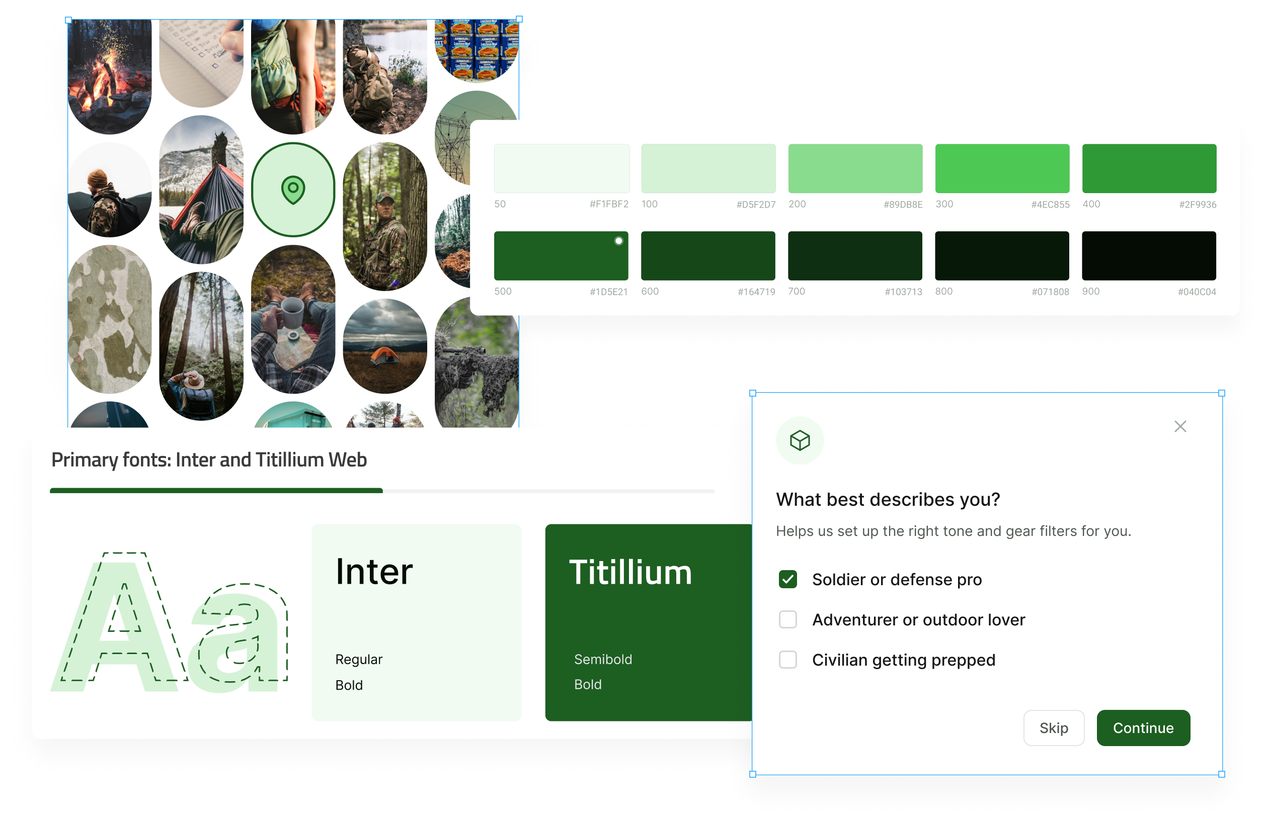
A Lighter, Sharper Brand Direction
The old version leaned heavily into dark, military-style tones. While that made sense historically, it also made the app feel bulky and outdated, especially for users coming from the civilian world. The branding hadn’t been a major focus, so things like typography, contrast and overall tone hadn’t been carefully considered.
I introduced a lighter, more neutral palette with green accents to keep a sense of mission-readiness, but with a fresher, more modern startup feel. This visual shift was paired with a new tone of voice: clear, friendly and calm. Crisis-preparedness tools often heighten anxiety, so it felt important that Steelcore took the opposite approach: grounded and supportive.
The new branding brought clarity and confidence to the UI and the team immediately felt it was a better fit for where they wanted the product to go. A full brand identity update, including a new name and logo, is planned for future phases.
The Steelcore redesign focused on making the app clear, simple and easy to act on. From streamlined onboarding to restructured navigation and motivational elements like readiness scores, every decision was made to help users move from planning to action.
Key Takeaway: what mattered most wasn’t making the app look better, it was helping people feel more in control. Every change, from tone of voice to structure, was about lowering stress and making action feel doable.
Once development is complete, we’ll start testing. User feedback will drive the next round of revisions, ensuring the app keeps improving with every iteration.
Hi I'm Ragne
I work with people who care deeply about what they're building. If that's you—hello. 👋
Drop me a line!
I will respond within a day